"A Special Equation between Visual Lightness and the Luxurious Impression of Interior Architecture through the New Classic"
Published in Social Sciences, Sustainability, and Arts & Humanities
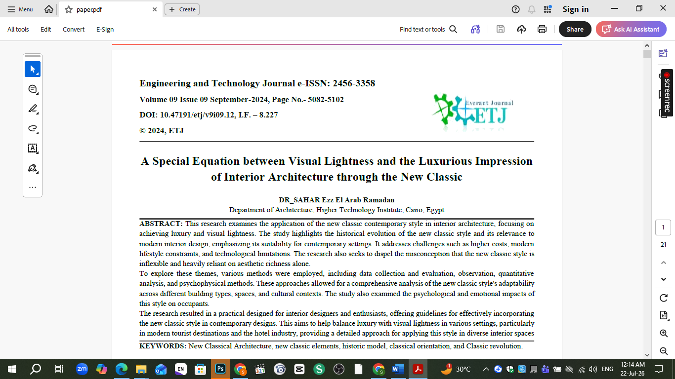
10.47191/etj/v9i09.12
Every time I brought up neoclassical interiors in a design conversation, I got the same reaction: too heavy, too ornate, too much gold leaf for a client who wants a bright, contemporary home. That dismissal never sat right with me. The New Classic style has real historical depth — it survived the shift from Baroque excess to Enlightenment rationalism, and it's still used successfully in some of the most luxurious hotel interiors in the world. So the real question wasn't whether New Classic still belongs in interior architecture. It was whether we've simply forgotten how to apply it without the visual weight that gives it a bad reputation.
Tracing where the style actually came from
Before proposing anything new, I wanted to understand where New Classic came from and why it split into different directions. The revolutionary classical orientation emphasized powerful, unmistakable historical motifs. The romantic orientation borrowed the purity of Greek forms but softened them. And the "ideal" or fantasy orientation pushed classical language toward something more abstract and imaginative — you can see it in projects like Ledoux's Cenotaph for Newton, which barely resembles a classical building at all, yet is unmistakably rooted in classical thinking. Understanding these branches mattered because "New Classic" today usually collapses all of them into one vague, overdecorated stereotype.
Learning from French hotel interiors
France gave me the clearest real-world laboratory for this research. Hotels there have used New Classic interiors continuously since the 18th century, adapting the style generation after generation rather than treating it as a museum piece. I looked closely at several — a converted 1728 residence on rue d'Anjou, Hôtel Athénée's bar and reception areas, L'Aubergade in Puymirol, and a restored bastide in Provence. What struck me wasn't the ornamentation itself, but how each renovation deliberately mixed classical vocabulary — panelling, columns, gilded details — with distinctly modern elements: clean white walls, wrought-iron staircases, minimal furniture silhouettes. The luxury came from restraint as much as from decoration.
Comparing Egypt and the Gulf
Once I had a clearer picture of the style's mechanics, I wanted to test it against a very different question: does culture and budget change how New Classic gets applied? Comparing residential interiors in Egypt versus the Gulf states turned out to be one of the most revealing parts of this research. Gulf interiors tend to lean into full, unapologetic luxury — heavier gold accents, richer colour palettes, higher-end marble and fabric choices, larger decorative elements like chandeliers and mirrored panels. Egyptian interiors, by contrast, are usually simplified versions of the same vocabulary, often for practical cost reasons — dark wood furniture, quieter colour schemes, more restrained ornamentation. Same design language, very different expression, driven almost entirely by local economics and lifestyle expectations.
What actually creates "visual lightness"
The core finding of this research is that visual lightness in New Classic interiors doesn't come from removing classical elements — it comes from how you deploy them. A few patterns kept showing up across every successful example I studied:
- Pastel and neutral palettes (beige, ivory, pale blue, soft grey) instead of saturated, heavy colour
- Symmetry used selectively — mainly in bedrooms and living rooms, not forced into every space
- Simplified mouldings and panelling rather than dense ornamentation
- A small number of statement pieces (a chandelier, a mirror, a fireplace) rather than decoration everywhere
- Mixing dark wood or wrought iron with lighter modern materials to keep the eye moving
None of this required abandoning the style. It required editing it.
Turning research into a practical design guide
The part of this project I'm most proud of is translating all of this into something usable — a room-by-room approach for designers actually working on an apartment. Living rooms lean on neutral palettes with gold or brass accents and a single grand lighting piece. Dining areas take a dark wood table with upholstered, high-backed chairs. Kitchens use white or cream cabinetry with brass hardware, letting the classical language show up in small details rather than the whole room. Bedrooms get a four-poster or upholstered headboard, heavier drapery, and gilded mirrors — but balanced against light flooring and simple wall treatments. Bathrooms bring in marble and brass fixtures, but only as accents against otherwise clean white surfaces.
Where I'd like to take this next
This research focused on residential and hotel interiors in France, Egypt, and the Gulf, but I'd love to see how the same principles hold up in other cultural contexts — Southeast Asia, Latin America, or regions with their own strong classical or colonial architectural heritage. I'm also curious whether the same "restraint creates lightness" principle applies to commercial and hospitality spaces at a larger scale, not just individual apartments. If you've worked with New Classic or neoclassical interiors in a different cultural setting, I'd love to hear how the balance between luxury and visual lightness played out for you.

Personal Data
§ Name: Sahar Ezz EL Arab Ramadan Said .
§ Position: Associated professor in Architecture department,
in Higher Technology Institute in 10th of Ramadan.
§ Department: Architecture Department.
§ Contact: saharezz_1@hotmail.com .
§ Mobile No: 01152262151 .
Specilization
§ General Specialization: Decor department.
§ Specific Field : Interior Architecture .
Academic Positions.
· Associated professor in Architecture department in Higher Technology Institute in 10 th of Ramadan (Interior Architecture courses+architecture courses) from first term in 2019 till this date 16-12-2021 .
· Lecture in Architecture department in El Shorouk High Institute of Engineering (Interior Architecture courses+architecture courses) from 2017 - 2019.
· Lecture in Architecture department in Tebes High Institute of Engineering ( Interior Architecture courses+architecture courses) from 2014-2017.
Activites and Experiences.
1-Participated in many Exhibitions in Interior Architecture in the Faculty of Fine Arts 2020 -2021 (IN Zamelk in big halls in the faculty).
2-Shared in competition of furniture for Governorates of Egypt that was organized by Ministry of War Production in 2018 for making economy and multiuse furniture in Asmart Buildings followed to the government.
Research Interests.
-Lights- Desgin of Interior studios.
- Utilizing the techniques of Interior architectural elements of Mamluk architecture in modern architecture
BIO
§ DR Sahar Ezz EL Arab received her PHD in Décor Department (Interior Architecture) from Faculty of Fine Arts (Alexandria University in 2013.
§ worked as lecture in Teba Institute of Engineering (teaching Interior Architecture subjects in Architecture department) from 2014-2017&
shared in Control tasks in Teba Academy from 2014-2017.
§ moved to El Shorouk Institute of Engineering (teaching Interior Architecture subjects in Architecture department) from 2017 – 2019.
§ had many certifications in quality from Quality Assurance Authority In El Shorouk Academy in 2017-2018-2019, also worked as assistant director in Quality committee from 2017-2019, and an internal examiner in Quality of all departments in El Shorouk Academy in 2019.
§ works till this date 16-12-2021 in Higher Technology in 10th of Ramadan (teaching Interior Architecture subjects in Architecture department) as Associated professor and Department Quality Coordinator.
§ worked as Quality Coordinator in Higher Technology in 10th of Ramadan2020-2021, as prepared with her quality teams The ministry's annual file for the department, and all courses files of the department`s subjects
§ working in preparing the department program to Nars2018.
§ Worked as main responsible in control committee last second term and summer term last year 2020-2021in Higher Technology in 10th of Ramadan.
Qualifications.
§ 2013 phd degree in Decor department - Interior Architecture.
(The balancing between human behavior and residential interior spaces). faculty of Fine Arts (Alexandria University)
§ 2003 Master degree in Decor department - Interior Architecture. (Islamic Architecture and its effect on Interior architecture of modern house) .
faculty of Fine Arts (Helwan University) .
§ 1997 B.SC in Decor department - Interior Architecture. faculty of Fine Arts (Helwan University ) .
Academic Positions.
· Associated professor in Architecture department in Higher Technology Institute in 10 th of Ramadan (Interior Architecture courses+architecture courses) from first term in 2019 till this date 16-12-2021 .
· Lecture in Architecture department in El Shorouk High Institute of Engineering (Interior Architecture courses+architecture courses) from 2017 - 2019.
· Lecture in Architecture department in Tebes High Institute of Engineering ( Interior Architecture courses+architecture courses) from 2014-2017.
Activites and Experiences.
1-Participated in many Exhibitions in Interior Architecture in the Faculty of Fine Arts 2020 -2021 (IN Zamelk in big halls in the faculty).
2-Shared in competition of furniture for Governorates of Egypt that was organized by Ministry of War Production in 2018 for making economy and multiuse furniture in Asmart Buildings followed to the government.
Research Interests.
-Lights- Desgin of Interior studios.
- Utilizing the techniques of Interior architectural elements of Mamluk architecture in modern architecture
Publication (The most important researches )
1-The balance between subjective and objective in Interior design: In July 2016,(International Design Journal ),folder 6 .
2-Design Solutions for administration buildings: In July 2017, (International Design Journal ), folder 7 .
3-Using lights to enhance performance in studios of Interior design: In 2018 ,(Fourth Research Youth Conference ), Arts, Tourism and Antiquities Sector.
4-Utilizing the techniques of Interior architectural elements of Mamluk architecture in modern architecture : In 28-30 April 2018 ,(The third international conference for creativity and development in architecture, heritage, arts and literature - Alexandria ).
5-Standards for evaluating the compatibility of interior design of residential buildings With its inhabitants in terms of (mental health - physical)As goals for sustainability: In 13-15 December 2018,( First International Conference on Sustainability )- Environmental Efficiency for a Better Living.
6-Using Lights in the age of Globalization to achieve new aims in studios of Interior design: In 2018, International Conference of Innovation and Development in Architecture ,Arts and Literature – (International Design Journal ), folder 7 .
7-Grids as important elements for Good Design : In27 -28 February 2018, (First Scientific Conference of the Faculty of Applied Arts - October University).
8-Acontemporary vision of the Interior design of Architecture and Arts Academic Institutions in Egypt : In26 July 2020,( International Design Journal) .
9-Finding a correlation between the Interior Design and the Urban Character :2020 ,(Journal of AL Azhar University Engineering sector ).
10-Necessarry Consideration for drawing halls in Interior design studios: January 2021 ,( Journal of Architecture, Arts and Human Sciences published by the Arab Society for Islamic Civilization and Arts)).
11-Lights only to make a creative design:2020,1th ICEE2020 ( 1st International Conference on Engineering Education Present and Future 2020 )-Assuit university.
12-Guide for longevity and flexibility in Interior architecture ,Published: 28 April 2025,Volume 2, article number 46, (2025)-Springer Nature,Discover cities Journal
https://link.springer.com/article/10.1007/s44327-025-00066-2
13-A Special Equation between Visual Lightness and the Luxurious Impression of Interior Architecture through the New Classic,September 10, 2024,(Engineering and Technology journal )Online ISSN : 2456-3358
https://everant.org/index.php/etj/article/view/1527
14-Sustainable Development Interaction between Humans and the Interior Architecture:September 23, 2024,(Engineering and Technology journal ),Online ISSN : 2456-3358
https://everant.org/index.php/etj/article/view/1514
Follow the Topic
Introducing the Palgrave Macmillan Campaign for the Humanities
At Palgrave Macmillan we publish cutting-edge humanities research that has real-world impact. This research community brings together the voices of our authors and editorial team to highlight and publicize the value of the humanities and humanities research in our world today.
Continue reading announcement