We’ve organized all the Points of View columns on data visualization published in Nature Methods and provide this as a guide to accessing this trove of practical advice on visualizing scientific data.
As of July 30, 2013 Nature Methods has published 35 Points of View columns written by Bang Wong, Martin Krzywinski and their co-authors: Nils Gehlenborg, Cydney Nielsen, Noam Shoresh, Rikke Schmidt Kjærgaard, Erica Savig and Alberto Cairo. As we prepare to launch a new column in our September issue we felt this would be a good time to collect and organize links to all the Points of View articles together in one place to make it easier to navigate this wonderful resource that the authors have provided us. For the month of August we will be making all the columns free to access so everyone can benefit from this practical advice on data visualization.
This should not be the end of the Points of View column though. We will be inviting new visualization experts to author articles on new topics that have not been covered so far or which can be expanded on. This page will be continuously updated whenever a new article is published so stay tuned. If you have a suggestion for a topic you would like to see covered in a future points of view article please comment below.
Update of March 28, 2015: A PDF eBook of the 38 Points of View articles published between August 2010 and February 2015 is now available at the Nature Shop for $7.99 under the title “Visual strategies for biological data: the collected Points of View”. The article summaries below provide a nice overview of what is contained in that eBook collection.
. . . . . . . .
Introduction
Visualizing biological data – December 2012
Data visualization is increasingly important, but it requires clear objectives and improved implementation
The overview figure – May 2011
An economic overview figure to convey general concepts helps readers understand a research study
. . . . . . . .
Composition and layout
The design process – December 2011
Use good design to balance self-expression with the need to satisfy an audience in a logical manner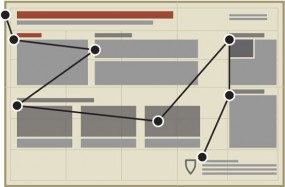
Layout – October 2011
Proper layout reveals the hierarchical relationship of informational elements
Gestalt principles (Part 1) – November 2010
Gestalt principles (Part 2) – December 2010
Exploit perceptual phenomena to meaningfully arrange elements on the page
Negative space – January 2011
Whitespace is a powerful way of improving visual appeal and emphasizing content
Salience to relevance – November 2011
Ensure that viewers notice the right content by making relevant information most noticeable
Elements of visual style – May 2013
Translate the principles of effective writing to the process of figure design
Storytelling – August 2013
Relate your data to the world around them using the age-old custom of telling a story
. . . . . . . .
Using color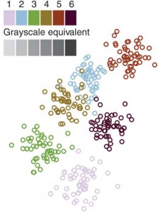
Color coding – August 2010
Choose colors appropriately to avoid bias and unwanted artifacts in visuals
Color blindness – June 2011
Make your graphics accessible to those with color vision deficiencies
Avoiding color – July 2011
Improve the overall clarity and utility of data displays by using alternatives to color
Mapping quantitative data to color – August 2012
Color is useful for compact visualizations of large data sets but must highlight salient features
Heat maps – March 2012
Color, clustering and parallel coordinate plots are essential for using heatmaps effectively
. . . . . . . .
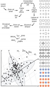 Elements of a figure
Typography – April 2011
Choose typefaces, sizes and spacing to clarify the structure and meaning of the text
Axes, ticks and grids – March 2013
Make navigational elements distinct and unobtrusive to maintain visual priority of data
Labels and callouts – April 2013
Figure labels require the same consistency and alignment in their layout as text
Plotting symbols – June 2013
Choose distinct symbols that overlap without ambiguity and communicate relationships in data
Arrows – September 2011
Use well-proportioned arrows sparingly and consistently as a guide through complex information
. . . . . . . .
Plot types
Bar charts and box plots – February 2014
Choose the appropriate plot according to the nature of the data and the task at hand
Sets and intersections – July 2014
Euler and Venn diagrams are appropriate for up to three sets but for greater numbers use more scalable plots
Heat maps – March 2012
Color, clustering and parallel coordinate plots are essential for using heatmaps effectively
Temporal data – Feb 2015
Use inherent properties of time to create effective visualizations
Unentangling complex plots – July 2015
Carefully designed subplots scaled to the data are often superior to a single complex overview plot
Pathways – January 2016
Apply visual grouping principles to add clarity to information flow in pathway diagrams
Neural circuit diagrams – March 2016
Use alignment and consistency to untangle complex neural circuit diagrams
. . . . . . . .
Improving figure clarity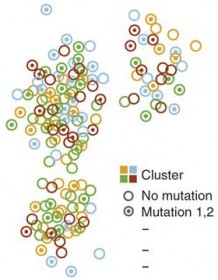
Simplify to clarify – August 2011
Simplify your presentation to improve clarity
Design of data figures – September 2010
Improve figure decoding by using strong visual cues to encode data
Salience – October 2010
Use salience to differentiate graphical symbols and speed up figure reading
Points of review (Part 1) – February 2011
Examples of figure redesigns
Points of review (Part 2) – March 2011
Simple tips to improve pie chart, scatter plot and color scale data displays
. . . . . . . .
Multidimensional data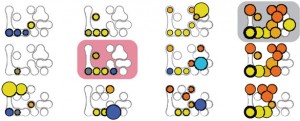
Into the third dimension – September 2012
3D visualizations are effective for spatial data but rarely for other data types
Power of the plane – October 2012
Combine 2D plots for effective visualization of multivariate data
Multidimensional data – July 2013
Visually organize complex data by mapping them onto familiar representations of biological systems
. . . . . . . .
Data exploration
Pencil and paper – November 2012
Quick sketches and doodles of data or models aids thinking and the scientific process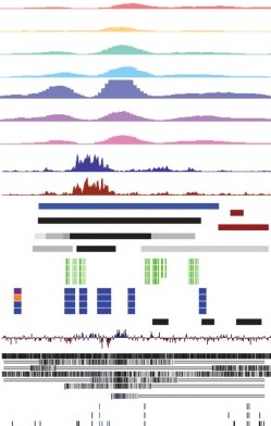
Data exploration – January 2012
Create ‘slices’ of data to enhance the process of pattern discovery
Networks – February 2012
Choose your network visualization based on the patterns you are looking for
Heat maps – March 2012
Color, clustering and parallel coordinate plots are essential for using heatmaps effectively
Integrating data – April 2012
Combine visualizations of multiple data types to find correlations and potential relationships
Representing the genome – May 2012
Limit what is displayed based on the question being asked
Managing deep data in genome browsers – June 2012
Compaction and summarization help find patterns in overwhelming data
Representing genomic structural variation – July 2012
Use arcs, color, dot plots and node graphs to show relations between distant genomic positions
. . . . . . . .
Please sign in or register for FREE
If you are a registered user on Research Communities by Springer Nature, please sign in