Like
Liked by Jianguo Gao
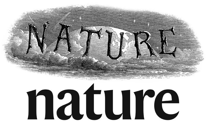
In its 150th year, Nature has been redesigned for clearer research communication in the digital age.

Read about the design decisions behind Nature’s new look, including its custom typeface, here. And explore our gallery of past designs below.
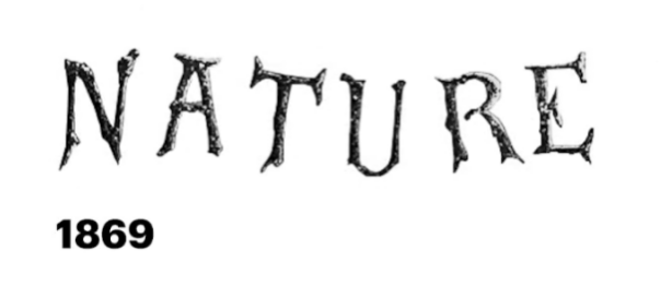
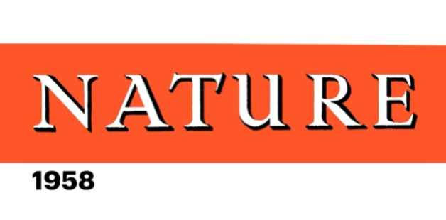
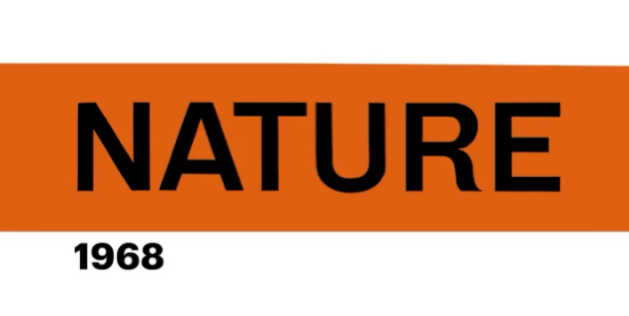
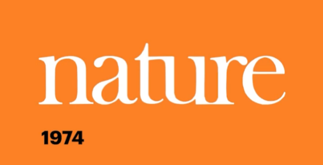
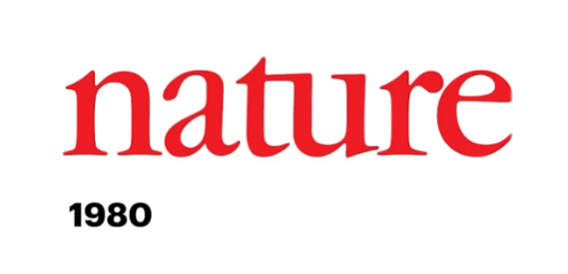

What do you think of Nature’s new look? Let us know below if you like.
Follow the Topic
Ecology
Life Sciences > Biological Sciences > Ecology
-
Nature
A weekly international journal publishing the finest peer-reviewed research in all fields of science and technology on the basis of its originality, importance, interdisciplinary interest, timeliness, accessibility, elegance and surprising conclusions.
Please sign in or register for FREE
If you are a registered user on Research Communities by Springer Nature, please sign in
Is the Harding typeface going to be available for non-Springer/Nature users? It looks absolutely wonderful, and I really, really want it. I love the tall x-height!
Thanks for your comment - we love Harding too! Sadly the Harding font is only for Nature-branded journals, but our creative designer was really pleased to hear the feedback.