The hidden map of measles risk: why zooming in changed everything
Published in Ecology & Evolution and Biomedical Research


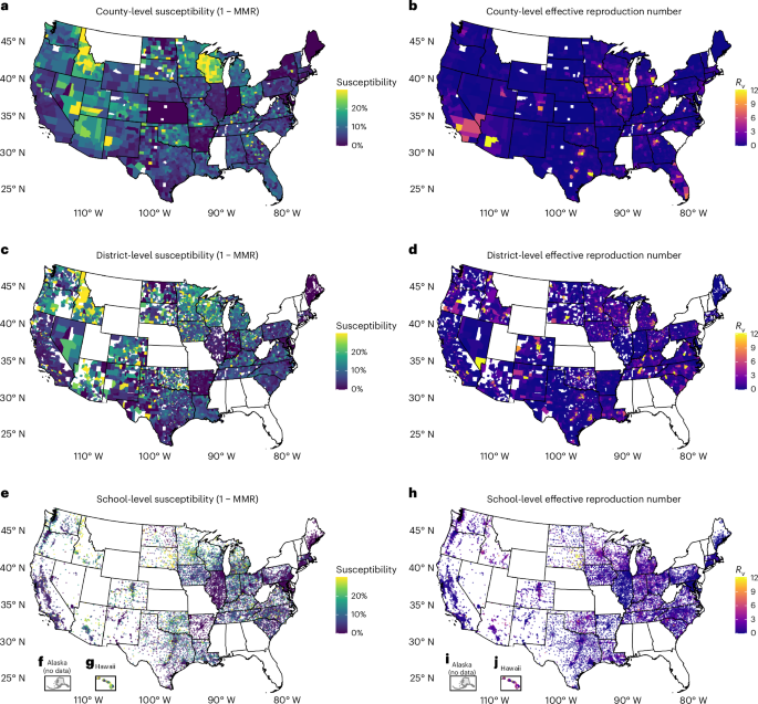

Behind the Paper, Nature Medicine County, district and community-level measles transmission in the United States in 2013-2025 · 10.1038/s41591-026-04561-w
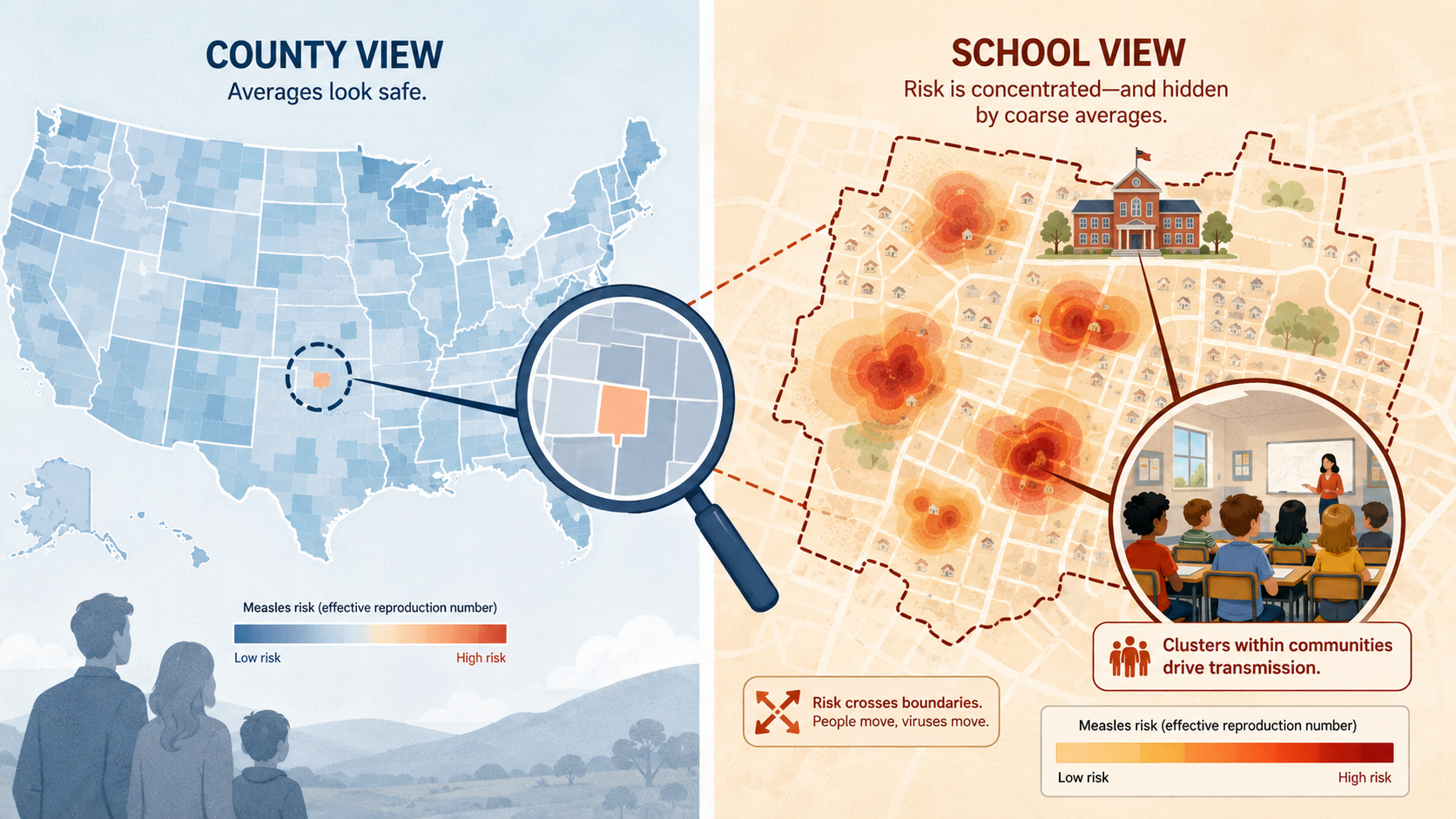
The same country, two resolutions. Illustration.
When "safe" numbers hide a dangerous reality
In January 2025, measles began spreading in Gaines County, Texas. Within weeks it had reached more than a dozen counties, and the US went on to record the largest domestic outbreak in three decades. It has not stopped. As of 30 July 2026, the CDC had confirmed 2,371 cases this year alone across 45 jurisdictions, already more than the whole of 2025 and the highest annual count since 1991. This November, the Pan American Health Organization’s Regional Verification Commission will decide whether the United States still qualifies as having eliminated measles, a status it has held since 2000.
Here is the part that kept me up at night. Open a public health dashboard the week before that outbreak started, look up Gaines County, and you would have seen a reproduction number below 1. Sub-threshold. Nothing to flag. The county where the largest US measles epidemic in thirty years was about to begin looked, by the standard metric, safe.
That is not a data error. It is a resolution error, and understanding it is what this paper is about.
Averages can deceive
Measles is the most contagious of the classic childhood infections. One case can generate roughly 15 more in a fully susceptible population, which is why the herd immunity threshold sits so high, at around 95% coverage. That single number anchors almost all vaccination policy in this country.
But 95% of what? Coverage is never uniform within a county. A handful of schools with very low vaccination rates can sit next door to schools with excellent coverage, and averaging them together makes the picture look fine even though a cluster of susceptible children in one building is more than capable of sustaining an outbreak.
Epidemiologists have suspected this for decades. Nobody had measured it across an entire country, at every scale at once. That turned out to be the hard part: US immunization reporting is radically decentralized, every state running its own system in its own format, and some not reporting at all. Building the database, 45 states plus Washington DC, over 50,000 schools and 3,000 counties back to 2013, fell largely to my postdoc Siyu Chen. It meant chasing PDFs, emailing health departments, and reconciling a school’s name across twelve years of spreadsheets in which it was spelled four different ways. There is no clever methods section for that. There is just persistence.
The arithmetic that hides an outbreak
Once the data existed, the central result was almost embarrassingly simple to demonstrate. Consider five schools in one district:
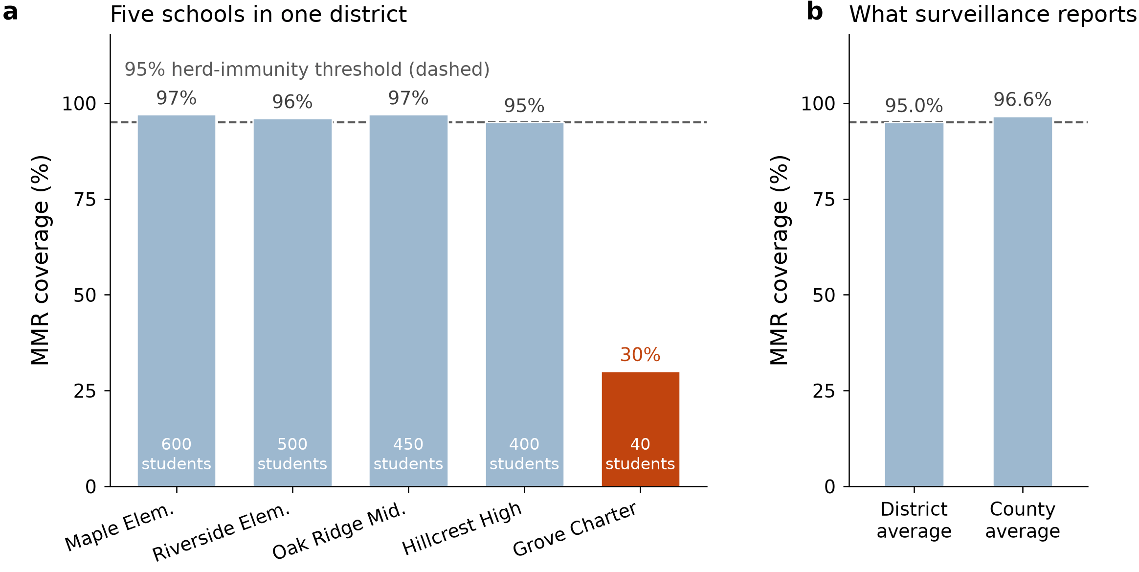
How one under-vaccinated school disappears into a reassuring average. A 40-student school at 30% coverage sits inside a district that reports 95% and a county that reports 96.6%. Both aggregate figures are arithmetically correct, and both hide the risk.
Four large, well-vaccinated schools and one small school at 30% coverage. Take the enrollment-weighted average and the district reports exactly 95%. Roll it up to the county and you get 96.6%. Both numbers clear the threshold, both are arithmetically correct, and both are useless, because measles does not spread through a weighted average. It spreads through the 40 children sitting in the same building.
Watch what averaging does to the same landscape:
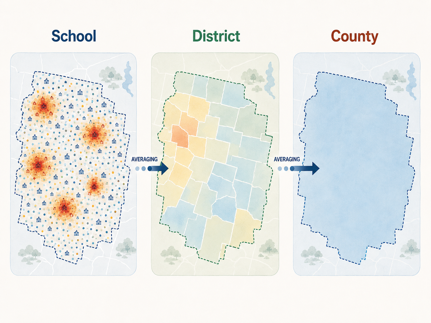
The same risk landscape, averaged twice. By the time it reaches county scale the hotspots have vanished. Conceptual illustration, not mapped estimates.
Building a model that sees schools, not just states
Coverage on its own is not risk. To get there we needed the effective reproduction number, Rv: the average number of new infections one case would generate given how many people around it are protected. Above 1, an outbreak can sustain itself. Below 1, it fizzles out.
We calculated Rv not just for counties but for individual schools and districts, using a model that accounts for how people actually mix: children interact intensely with classmates, less with children in neighboring towns, less still with those a county away. This is a gravity model, borrowed from the logic that describes how trade and migration decline with distance.
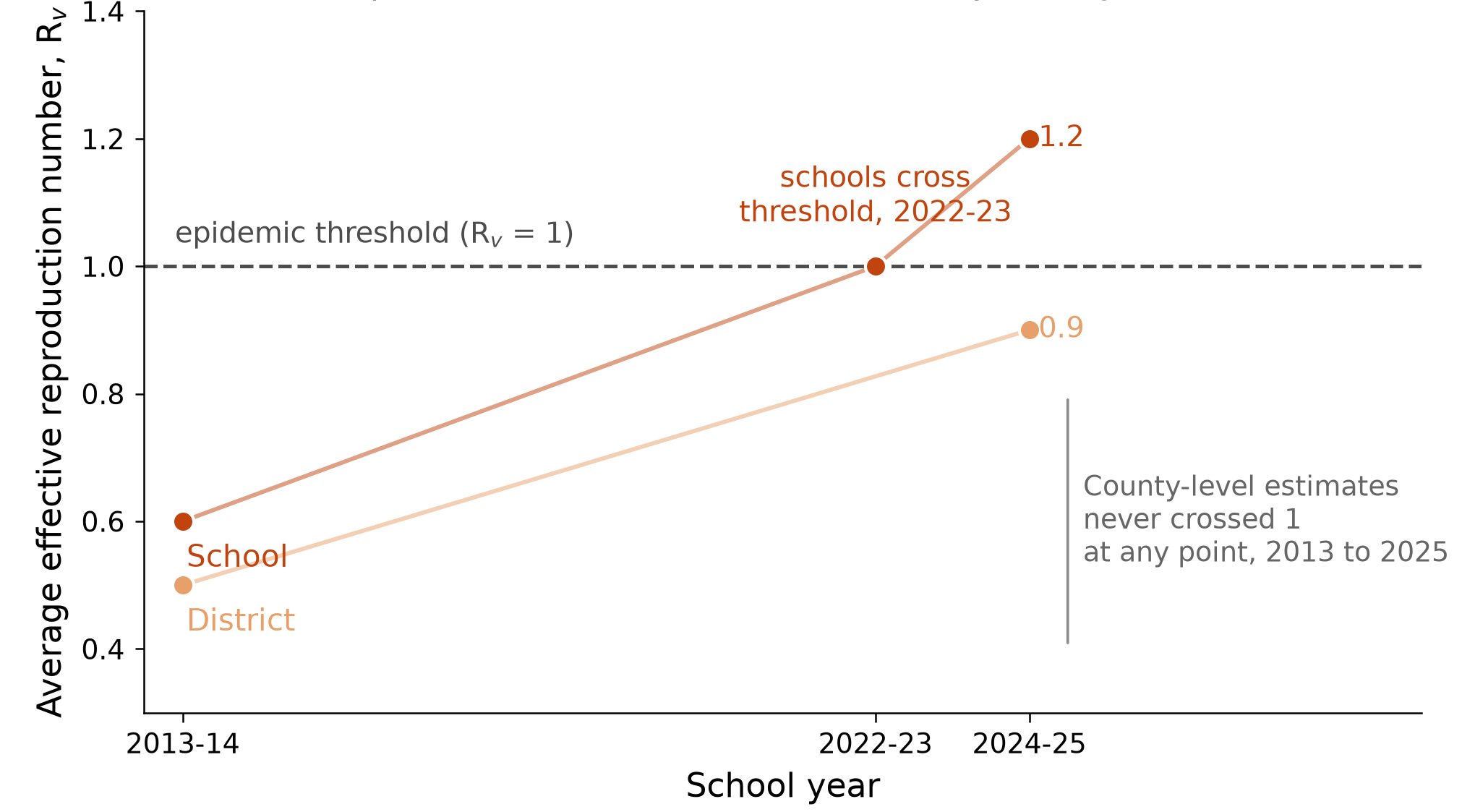
Running it across the full database let us put a date on something long theorized but never measured. Average school-level transmission potential crossed 1.0 in 2022-2023, and has kept climbing since, to roughly 1.2. Conditions favorable to sustained measles transmission were already the norm in American schools, years before the headlines caught up. County-level estimates stayed below 1 throughout: reassuring, and wrong. The country crossed the epidemic threshold three years ago at the scale where outbreaks start. The scale we monitor never registered it.
Following the outbreaks back to their roots
A model that explains everything after the fact explains nothing. So we tested ours against seven real US outbreaks between 2017 and 2026, and asked a blunt question: before each began, did our estimates flag the place it started?
School-level estimates ranked all seven epicenters in the top 10% of risk. District-level caught six of seven. County-level caught three.
Texas is where this began, so start there. Before the 2025 outbreak, Gaines County was invisible at county scale. One administrative level down, Seminole ISD already ranked at the 93.5th percentile statewide, and Loop ISD’s MMR coverage had fallen to 20.0% in 2024-2025.
South Carolina makes the same point at larger scale. Its 2025-26 outbreak, which grew to nearly a thousand cases, began in Spartanburg County. Before a single case was reported, the highest-risk school in the county sat in Spartanburg School District 5, with MMR coverage of 21.3% and a risk estimate in the 99.7th percentile statewide. A number utterly invisible in the county’s respectable-looking average.
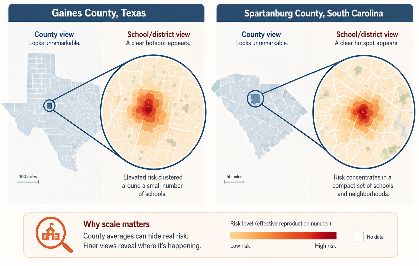
The signal was there. It was sitting one or two administrative levels below where anyone was looking.
Borders don't stop a virus
I expected the aggregation result. I did not expect this one.
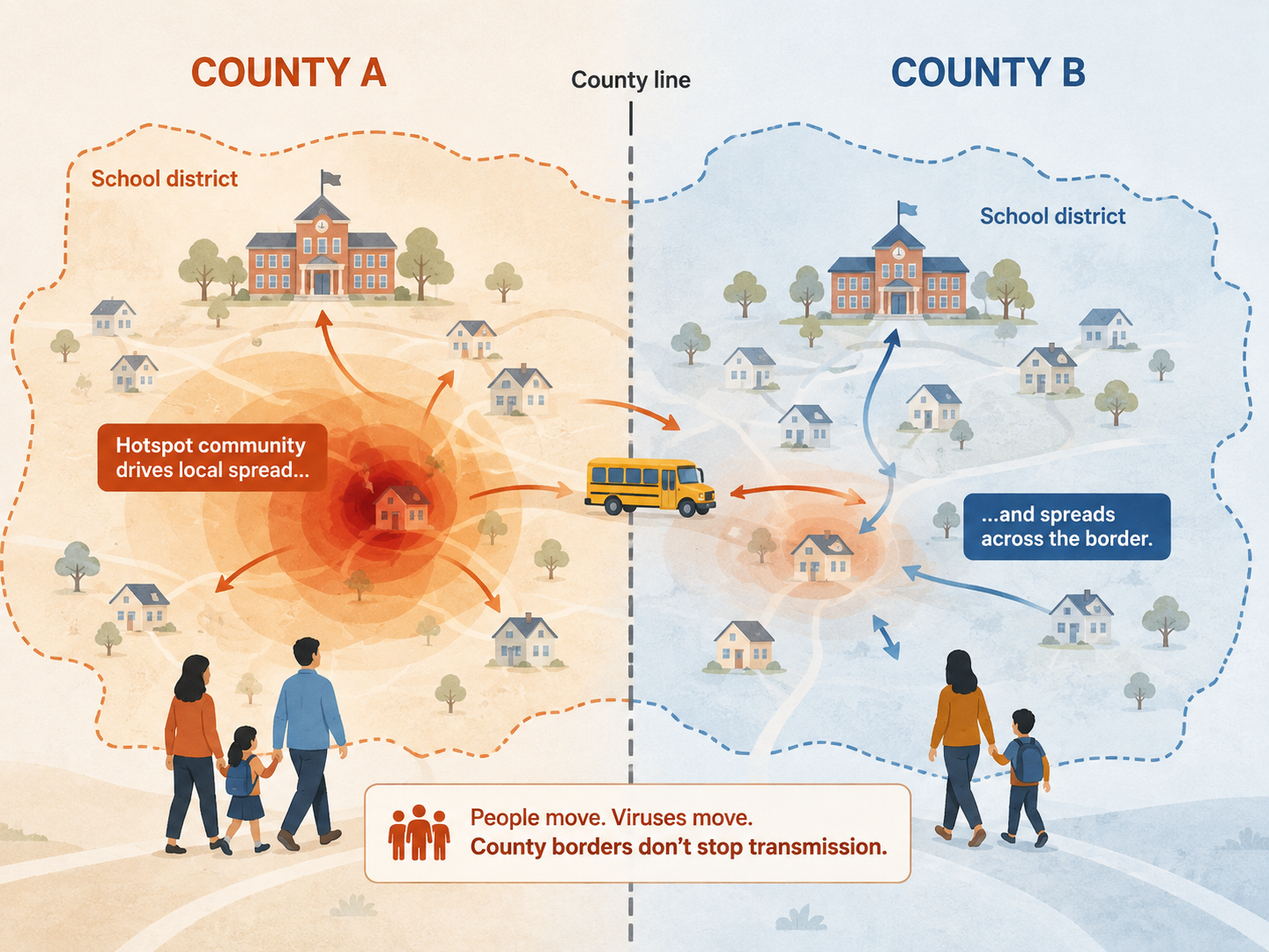
School district boundaries frequently do not line up with county lines. Children from one county attend school in another, sharing buses, classrooms and playgrounds. They move within districts, not counties, and so they mix across boundaries that surveillance treats as walls.
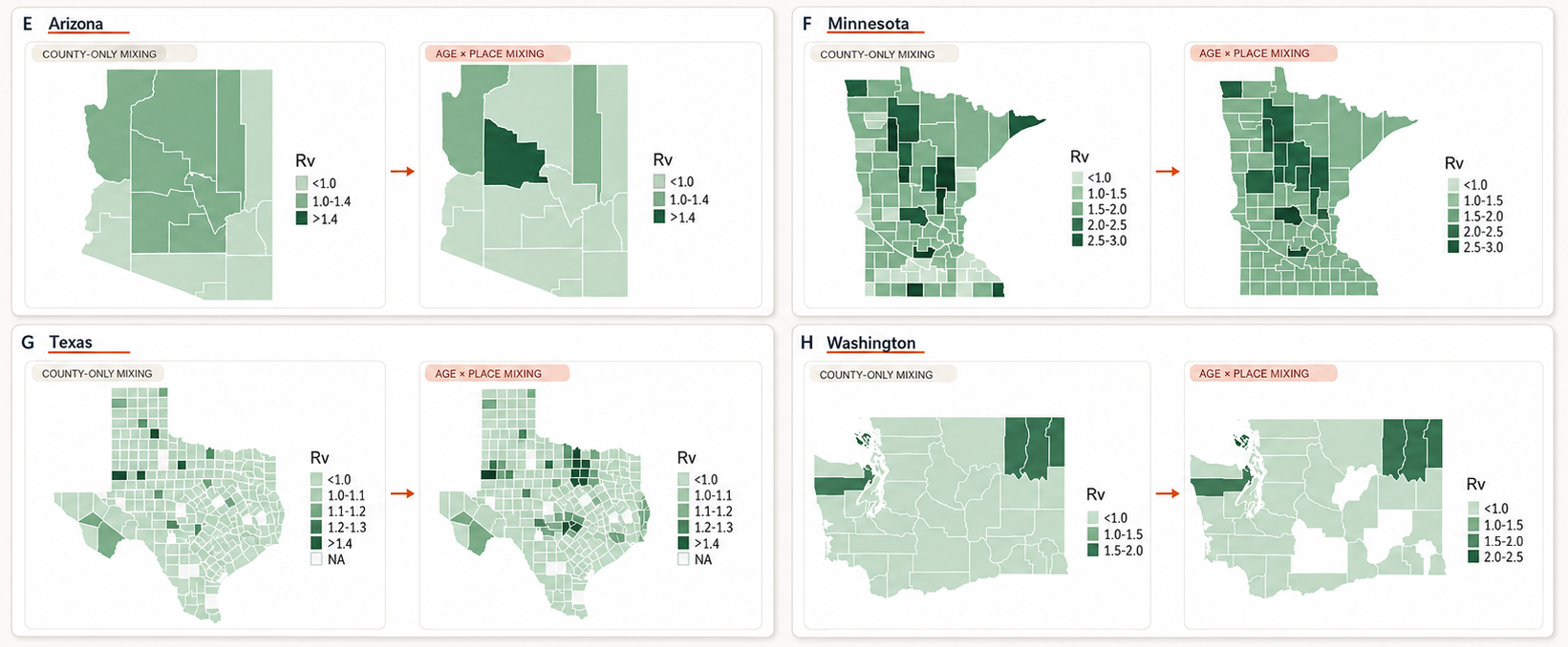
When we built that structure into the model, well-vaccinated counties started crossing the epidemic threshold purely through spillover from their neighbors: 21 of Minnesota’s 87 counties, 26 of Texas’s 254, five in Washington and four in Arizona. Counties whose own immunity would have protected them in isolation, tipped over by connections their surveillance cannot see.
When school districts cross county lines, measles risk moves with them. Comparing a model where children mix only within their own county against one that accounts for age-specific mixing across district boundaries among 5 to 17 year olds produces a visibly different risk map.
This has an uncomfortable implication for local preparedness. A county health department can be doing everything right, look at its own excellent coverage figures, and still be at genuine risk, because its risk is not a property of its own jurisdiction.
What surprised me most
Beyond the spillover, the finding that has stayed with me is how much susceptibility has grown since the COVID-19 pandemic. It roughly doubled, from about 5% to somewhere between 8% and 10%, quietly crossing a threshold that took decades of hard-won vaccination progress to secure.
The pattern is not uniform, though, and that is the hopeful part. After California’s SB277 removed non-medical exemptions in 2016, the accumulated susceptible population visibly declined as under-vaccinated cohorts aged out. You can see the intervention in the data. Minnesota, over the same period, deteriorated steadily. These are choices, not weather.
California is also a caution against reading too much comfort into a good average. The state reported over 95% kindergarten coverage for 2024-25, and has still confirmed 53 cases by late July 2026, more than double the 25 it recorded in all of 2025, almost all in people unvaccinated or of unknown status. Policy shrank the susceptible pool; it did not build a wall around the state. When transmission is this widespread nationally, imported cases find whatever clusters remain. That is this paper’s argument stated in the negative.
What I think should change
If transmission potential sits above the threshold in schools and districts but below it in counties, then surveillance has to operate where the risk is: real-time school and district dashboards, coordination between jurisdictions that share districts rather than borders, and catch-up clinics aimed at identified clusters rather than at counties whose averages look fine. None of this requires new science. It requires reporting at the resolution where children actually mix.
Worth being honest about what we did not capture. We measured transmission potential, not cases, and homeschooled children, concentrated in exactly the communities we flag, are missing from our data altogether. Both point the same way: if anything, we are underestimating the risk.
Why this matters beyond measles
My hope is that this work changes how surveillance is designed, not just for measles but for any infection that spreads through tightly knit groups like schools. Neither the mismatch nor the erosion of coverage driving it is unique to the US: Europe has recorded its highest measles incidence in 25 years, the UK saw its first child death from measles in a decade, and Canada lost its elimination status in November 2025.
The US now faces the same review, and with 2026 already past the 2025 total it is no longer hypothetical. The commission has to decide whether transmission has run unbroken for twelve months, which turns largely on sequencing: whether the outbreaks since January 2025 are one chain or a series of importations that each burned out. Another question about resolution, asked of the virus’s family tree rather than the map. I will not guess the answer. What our data show is why the risk was building long before anyone had to ask.
These are choices, not weather. Measles is often called nature’s canary in the coal mine for vaccine-preventable disease resurgence, because it is so contagious that it is usually the first to come back when population immunity slips. Our data suggest the canary has been singing for a while. We just were not listening at the right resolution.

Ana I. Bento is an infectious disease ecologist in the Department of Public and Ecosystem Health, College of Veterinary Medicine, Cornell University. Her paper with her postdoc Siyu Chen, "County, district and community-level measles transmission in the United States in 2013-2025," was published in Nature Medicine (DOI: 10.1038/s41591-026-04561-w). The work was supported by Cornell Atkinson Center seed funds.
Follow the Topic
-
Nature Medicine
This journal encompasses original research ranging from new concepts in human biology and disease pathogenesis to new therapeutic modalities and drug development, to all phases of clinical work, as well as innovative technologies aimed at improving human health.

Related Collections
With Collections, you can get published faster and increase your visibility.
Clinical Research in Respiratory Medicine
Publishing Model: Hybrid
Deadline: Feb 18, 2027
Cancer Prevention and Control
Publishing Model: Hybrid
Deadline: Feb 19, 2027