Resonator Heat Map Measurements
Published in Electrical & Electronic Engineering
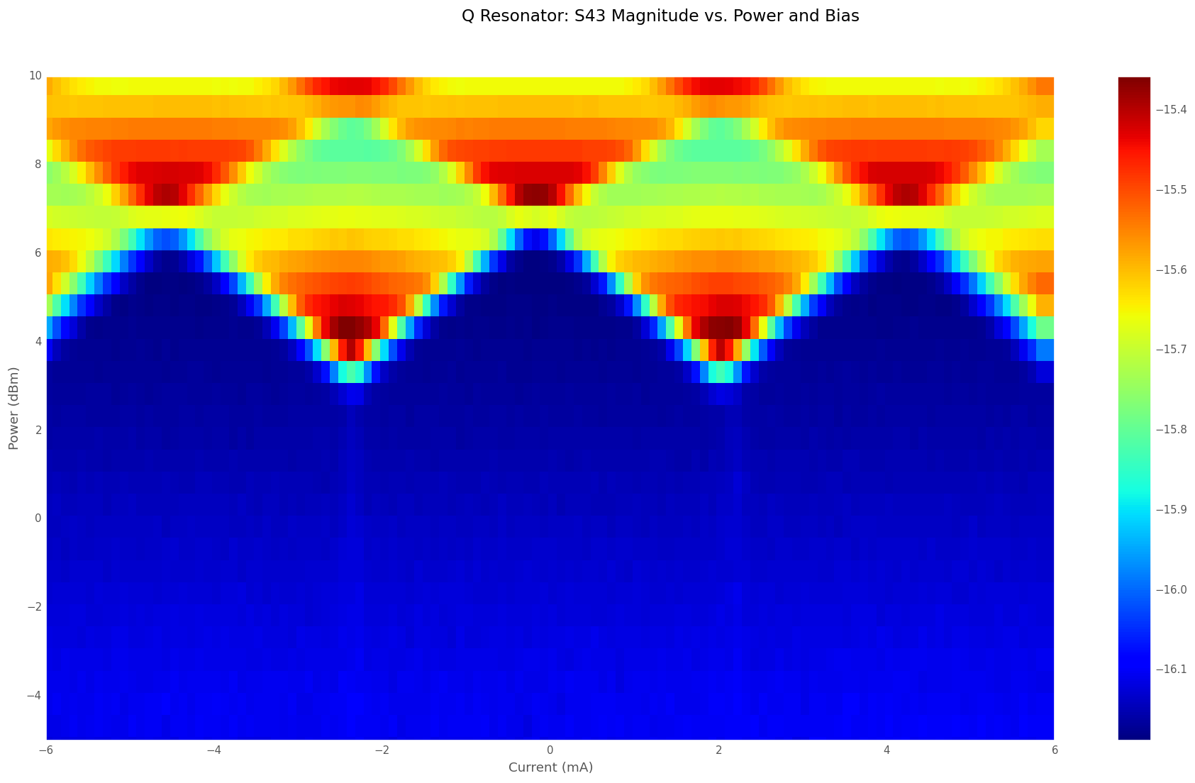
In our paper “A Resonant Metamaterial Clock Distribution Network for Superconducting Logic”, figure 2c is a heat map showing the magnitude of transmission through a resonant clock network as a function of RF clock power and DC bias current applied to an RQL circuit. When the clock power is high enough to cause the Josephson junctions to trigger, they draw power from the resonator. This causes a shift in the transmitted amplitude. The measurement is a valuable tool that may provide insight into the health of our circuits before any logic tests are performed.
We used a computer controlled four-port network analyzer and a current source (implemented by a voltage source and a 1Kohm resistor in series) to make the measurement. The analyzer is set up to sweep over a small set of frequencies centered on the resonance frequency. There are two traces, one for |S21| (the I resonator) and one for |S43| (the Q resonator). A marker is placed on each trace to follow the minimum of the trace on each network analyzer frequency sweep.
The control software employs a double loop. First the RF power is incremented one step, then the bias current is stepped from minimum current to maximum. The network analyzer frequency is then swept for each current step.
At the end of each sweep, the software reads the data back from the markers (for the minimum of each of the two S parameters, the marker provides frequency of the minimum, amplitude of |S21| (or of |S43| ) at the minimum, and the angle of the measured S parameter at the minimum. In principle, it is possible to create six heat maps from the measurement; the magnitude heat maps (one for I and one for Q), frequency (one for I and one for Q), and angle (one for I and one for Q). But in practice, the only significant heat maps are the amplitude heat maps, because frequency changes are often (but not always) imperceptible. Usually, the heat maps for I and Q resonator amplitude are nearly identical. If they are not, there is a (often unintentional) difference in the design of the two resonators.
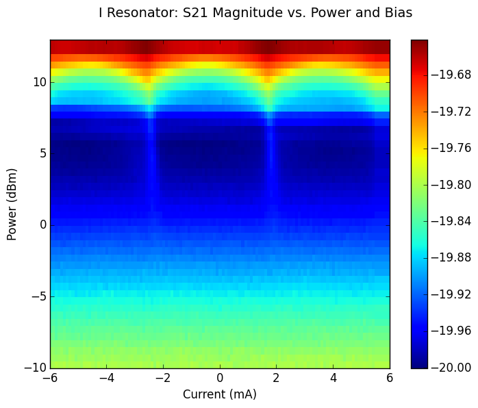
For a densely populated DynaZOR the amplitude at resonance may shift by as much as a few dB to as little few tenths of a dB, depending on design parameters. If the resonator is sparsely populated with junctions, the shift may be much smaller, and may be undetectable. A typical heat map shows the cumulative effect of many thousands of junctions drawing power from a DynaZOR clock network.
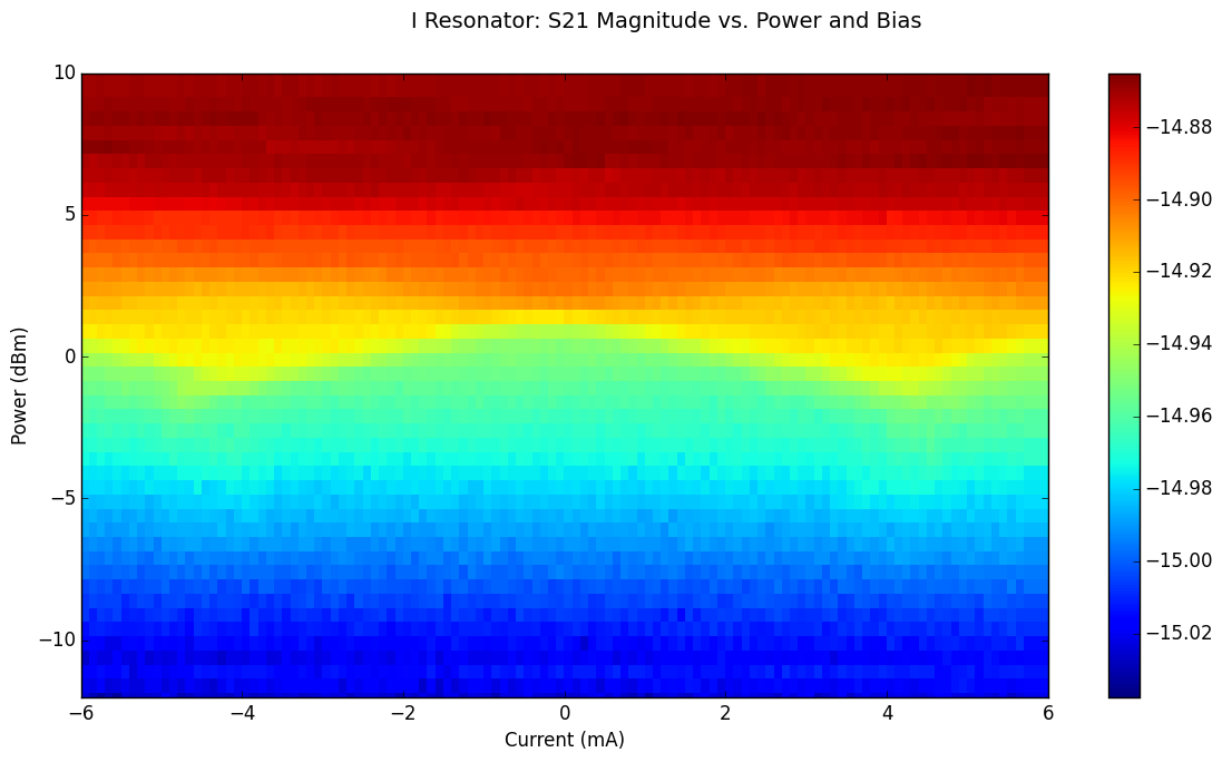
The heat map measurement can be a useful diagnostic tool and can be used to identify chips with manufacturing defects, such as wires with low critical current. Figure 3 shows a tulip-shaped heat map that resulted from a bias line with low critical current.
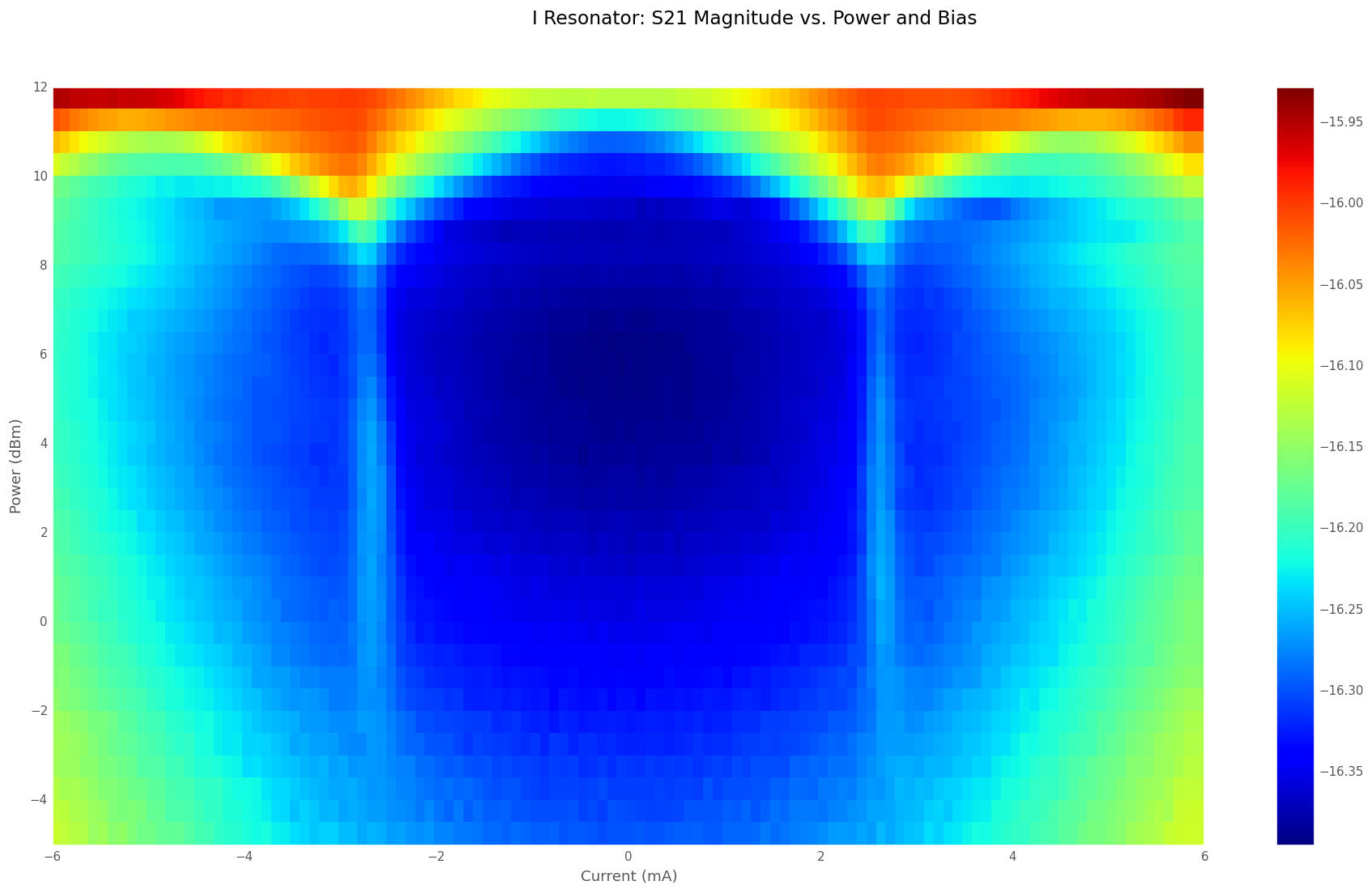
Figure 3 This chip had a bias line with an abnormally low critical current. As the current (x-axis) exceeded +/- 4mA, the resonance shifted due to heating, which resulted in this tulip-shaped heat map.
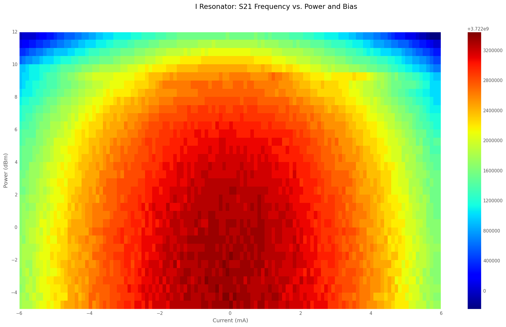
The heat map measurement is also interesting because it allows us to explore circuit dynamics in regimes that are not accessed in typical logic operation. For example, in Figure 5, we see interesting structure at higher powers. We observe diamond-shaped regimes where the junctions switch once per cycle, and higher diamonds where the junctions switch twice per cycle. They are also useful for detecting low critical current in parts of the bias circuitry (see Figures 3 and 4).

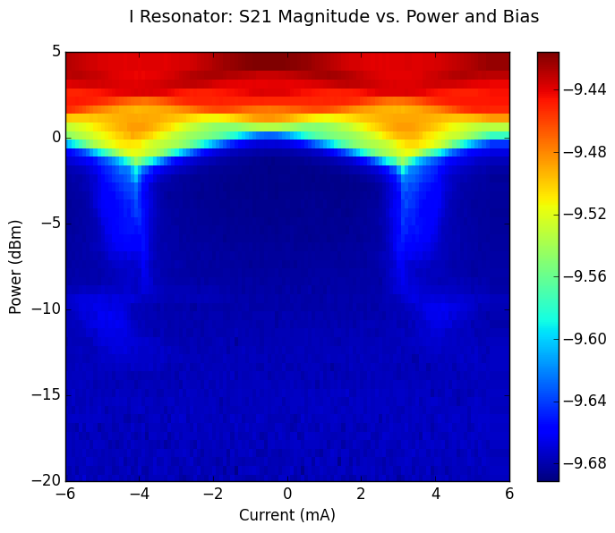
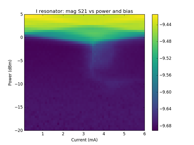
We used the “jet” color mapping originally as it is the default for Matplotlib, the Python package used to create these plots. Because of the way color is perceived, Jet emphasizes some small differences in the values being plotted. I tried using perceptually uniform colormaps, in particular Viridis. The structures that we were looking at were very muted in perceptually uniform color mappings. In this case, the perceptual non-uniformity of jet actually helps by emphasizing structure. (See Figures 6 and 7 below.)
Follow the Topic
-
Nature Electronics
This journal publishes both fundamental and applied research across all areas of electronics, from the study of novel phenomena and devices, to the design, construction and wider application of electronic circuits.


Please sign in or register for FREE
If you are a registered user on Research Communities by Springer Nature, please sign in