Heuristics for better figures
Published in Physics
Long before I thought about studying physics, I saw myself on the path to becoming a graphic designer. I enrolled in a graphic design program at a nearby college, had a well-stocked supply of brushes, pencils, and Bristol board, and even generated a portfolio of nearly 100 compositions before taking my first course. I ultimately left design school when I recognized the differences between “art for the sake of art” vs “art for the sake of selling a product,” but that’s a story for another day. In my year studying graphic design, I practiced and learned a set of skills that became extremely useful during my PhD. What I eventually came to discover was that when I was designing scientific figures, I felt confident that I was making rational design choices, such as visually distinct colours to represent categorical variables and thought-out colour gradients to represent continuous quantities. This blog post is about those design skills and is intended for my fellow researchers who never had the opportunity to learn the language of design. My hope is that I can serve as a useful translator to convey some of the practical ideas that designers routinely employ with respect to visual communication, and explain how they can be used in service of articulating a clearer scientific message.
Images are information
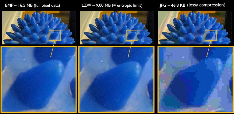
Before diving into specific tips, I want to establish some common ground on the idea that images are information. If you find this idea obvious or intuitive, then I’m glad we’re already on the same page. If you need a bit of convincing, here’s a couple of ways to look at it. (1) Information, by definition, is a message that reduces uncertainty. If you gaze at a wall, a table, the floor, or out a window, you are receiving messages in the form of visual images that inform you of what does or does not exist in these locations. Though pictures and figures are static snap-shots, they are also visually perceived messages that reduce uncertainty. Therefore images are information. (2) Thanks to modern technology, images are routinely transmitted through digital means. The process of preparing an image for digital transmission involves assigning colour values to each coordinate in a discrete rectangular grid of bitmapped pixels (Fig 1, left). To save time when shuttling images from computer to computer, a number of algorithms are available to compress the colour coordinate data into smaller files. Some compression algorithms, like LZW, can achieve file size reduction while still allowing for the original data to be perfectly reconstructed from the compressed data (Fig 1, middle). Other algorithms, like JPG, reduce file size by losing data, which manifests as pixel artefacts when the image is reconstructed (Fig 1, right). An interesting difference between lossless and lossy approaches is that lossless algorithms are bounded by the entropic limit of the original image, and cannot be compressed any further without sacrificing fidelity upon reconstruction.
But before I go too far down that rabbit hole, let me back out and return to the main point I’m trying to establish. The ability to encode and transmit images as information, which is what I’ve been talking about so far, is subtly different to my assertion that images are information. However, the fact that encoding, transmitting, and decoding the original image with perfect fidelity is an entropy-limited sequence of operations, makes it apparent that images are, in fact, message-containing and uncertainty-reducing. The amount of information in an image is directly related to its entropic content. Thus, the existence of lossless and lossy file compression schemes highlights the nature of images as information.
The case for colour psychology
If we can agree on the premise that images are information, then let’s turn to the more subjective topic of how images are perceived. Specifically, I’d like to make the case for colour psychology. Here’s what I learned in design school: colours have interpretive meaning associated with culture and context. Therefore, deliberate use of colour enables the designer to engineer how an image is perceived, oftentimes at an unconscious level.
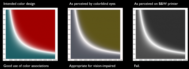
A concrete example illustrates how to use this principle. In a recent study of vehicle traffic, I was working with collaborators to show a transition between two phases of collective behaviour. The natural quantity for us to measure was the flux as a function of some parameters, which could be nicely visualized with a 2D heatmap. When the time arrived to generate publication-quality plots, I suggested a green/red theme for the colour choice (Fig 2, left). My sense was the colours would be intuitively perceived as the flow and no-flow phases because green and red are widely used as the colour-coded go and stop indicators for vehicle traffic. In other words, I was advocating for colours that build a parallel between their culturally-defined meaning on real-world roads and their quantitative meaning in our physical measurements. The end result is a phase diagram with an intuitive interpretation and minimal cognitive load when mapping the two regions of parameter space to the two flow phenomena.
To underscore the value of this approach, this layer of communication is facilitated without a single additional word or explicit recognition of the psychological associations related to the colour’s meaning. By tapping into this unspoken cultural association, the communication of our scientific point is substantively enhanced. A very similar bit of engineering with colour psychology is used with red/blue colours to indicate hot/cold temperatures. This colour theme is broadly seen in contexts ranging from thermostats and daily weather forecasts to kitchen and laundry room appliances; leveraging these colours for scientific figures just makes sense. A third example I recently came across at a conference used the monochromatic slightly-blue-tinted colour scheme commonly found in medical X-rays to map the spatial distribution of material aggregating on a surface. It was a brilliant example where the presenter was showing data on how mass density was spatially distributed, and by using the same colour scheme as an X-ray, there was a visceral intuitive understanding of how to interpret the image’s information.
The limits of visual communication
As with written and spoken communication, visual communication has its limits. The two big limitations to keep in mind are that 1 in 12 men are colour blind (whereas only 1 in 200 women are similarly affected), and many people (myself included) still use black and white printers. As a consequence, visual information can be miscommunicated. The reason I bring this up now is that the most common form of colour blindness is the inability to distinguish green and red. It was with this recognition in mind that the specific shades in the green/red colour map from the previous example were chosen (Fig 2, compare left and middle). When compensating for colour blindness, these shades were also tuned to accommodate black and white printing (Fig. 2, right). While the colour blind accommodation went pretty well, the greyscale-printer accommodation is less than perfect. Ultimately, herein lies the fundamental challenge of colour design. On one hand, you want to use colour to convey a contextualized message, but on the other hand, this additional layer of communication has to be balanced against hard constraints.
Reducing visual complexity
Perceptually-linear gradients
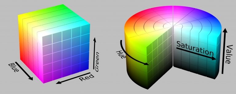
So what are the fundamentals for better visual communication when trying to express complex ideas? A good starting point is to reduce visual complexity. When I started my studies in design, the common red-green-blue (RGB) colour “coordinate system” was firmly embedded in my understanding of how to denote colours and generate colour gradients. The principle is simple. Mix an amount of red, green, and blue to arrive at the colour you would like to see on the screen (Fig. 3, left). What I subsequently learned is that this Euclidean mapping of colour space is great for computers, but totally mucks with colour perception. To understand what a better representation of colour space looks like, take the hue-saturation-value (HSV) coordinate system instead (Fig. 3, right). This coordinate space is cylindrical, with the hue being an angle variable, saturation being a radial variable, and value being the z-height. Now, let’s compare contours of constant coordinates in RGB-space and HSV-space. In the former, a straight line parallel to the R, G, or B axes causes changes in colours and even changes in colour lightness, depending on what the other two colours are held at (Fig. 3, left, compare straight lines parallel to any edge). Consequently, constant lines in RGB space do not translate to perceptually-linear gradients. Compare this situation with contours in the cylindrical space of HSV. By fixing S and V, we find H cyclically rotates through the colours with fixed levels of “light and darkness.” By fixing H and V, we see the contours go from a greyscale value to a full-colour value. By fixing H and S, we see the contours go from full black to full-colour. In other words, constant contours in HSV space are perceptually-linear, whereas constant contours in RGB space are not. The corresponding differences in visual complexity lead to tangible differences in how an image is perceived and where our eyes focus. The subject of colour space perception is much deeper than the tidbits here suggest, though the constant contours in cylindrical spaces highlights just one of the many useful insights the field of study offers.
Time and significance
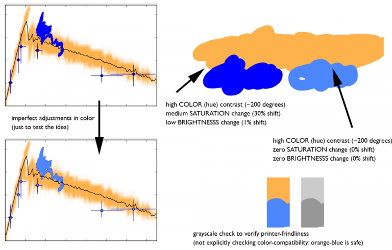
Visual complexity is an important topic and I want to go deeper on it, and at least show an illustrative example. The key metric to consider when discussing visual complexity is time. Specifically, how much time is spent viewing the image as a whole, how much time is spent viewing each element of that image, and how does the relative amount of time spent viewing a particular element correspond to that element’s significance. Another example from the above-mentioned collaboration helps show what I have in mind (Fig. 4, compare upper- and lower-left plot). The original version of the plot shows fluctuations from a simulation in an orange-tan colour with overlaid observational measurements in a default shade of blue. What I noticed while looking at the figure was that my eyes were spending more time on the blue data, and especially kept coming back to a particular set of measurements that looked like a scribble near the top of the plot. Without going into the detail of the measurement itself, this scribble of data was receiving a disproportionate amount of viewing time, and as a result, increasing the cognitive burden of decoding the figure’s meaning.
With the discussion of HSV above in mind, I sampled the colours (Fig. 4, upper-right) and found the difference between the orange-tan and blue was significant: 200 degrees in hue, 30% shift in saturation, and a negligible 1% shift in brightness. To decrease visual complexity, I brought the saturation and brightness shifts down to 0% and left hue where it was. The resampled blue ends up being more of a pastel colour that presents less of a jarring “edginess” when placed along-side the orange-tan (Fig. 4, upper-right colour swatch comparison). For good measure, it’s always wise to check whether a proposed colour combination is colour blind-compatible and B&W printer friendly (Fig. 4, lower-right). With these quality-control checks confirmed, the plot was regenerated with the new blue, and to my delight, the reduction in visual complexity let my eyes spend more time focusing on the plot as a whole rather than one specific feature.
Colour maps
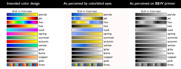
To bring everything together, pull out your favourite scientific plotting software package, look in the documentation for the plot commands, and take a careful look at the available colour maps. For me, this means MATLAB, which is a particularly interesting case study. Until a few years ago, MATLAB’s default colour map was “Jet” – a multicoloured rainbow that appears in multitudes of scientific figures. Spoiler alert – Jet is possibly the worst colour map you could be using. If you still use it, stop. Just stop. The reasons Jet is so bad include: (1) a high degree of visual complexity, (2) poor colour blind compatibility, (3) poor greyscale compatibility, (4) variable contrast, and (5) false features near the cyan and yellow bands. In fact, when Mathworks introduced their replacement for the default colour map, Parula, one of the developers working on the revamped graphics system wrote a series of four blog posts (1,2,3,4) and a related fifth follow-up about the shift from Jet to Parula, highlighting advantages of this new colour map.
Working within the themes already developed here, simply take a look at how MATLAB’s old and new default colour maps compare when placed side-by-side for colour blind testing and B&W printing (Fig. 5, top two rows). Parula has simple perceptually linear transitions whether viewed as-intended, by colour blind eyes, or on a greyscale printing. Jet, on the other hand, has non-linearities in the blueish region when viewed by colour blind eyes, and a dark-light-dark nonlinear gradient when printed in grayscale. When conveying quantitative information, these irregularities amount to visual miscommunication, and should drive figure-makers like you and me away from Jet whenever possible.
Scanning the rest of the colour maps leads to a few interesting conclusions about the other available colour maps (Fig. 5). For example, HSV is another widely available colour map, which in addition to being confusingly named after the HSV colour space mentioned above, is also a poor-performer with respect to colour blindness and grayscale. (As an aside, the reason the HSV colour map is so common is that it’s one of the few cyclic colour maps wherein the minimum and maximum values are the same colour. Usually, this colour mapping is applicable when plotting quantities like phase angle, where 0 and 2π are equivalent.) Beyond Parula, Jet, HSV, and their variants found in other scientific plotting software, the Hot colour map generally performs well and has nice colour psychology associations that can be leveraged when designing figures. Likewise, winter, gray, bone, copper, and pink, though not necessary the most aesthetic, also perform well on both colour blindness and grayscale tests. Keep these examples in mind, as they can be useful benchmarks and starting points when designing custom colour schemes.
So what are the key take aways?
-Think of images as information
-Use colour to communicate contextualized meaning
-Avoid visual miscommunication (colour blindness and B&W printing)
-Pick colour gradients that minimize complexity
-Question default colour schemes and choose among your options wisely
If you choose colours with the heuristics laid out here, you will be rewarded with better communicated figures. Because after all, figures are images, and images are information. Well-designed figures mean better communication, allowing your audience to spend more time focusing on your message and less time deciphering it.
Acknowledgements: JLS would like to thank Ye Jin Han, Shirley LI, Skanda Vivek, David Yanni, and Peter Yunker for their helpful suggestions in shaping this work. Data used in figures is taken from work available in the preprint: arXiv:1708.03791.


Please sign in or register for FREE
If you are a registered user on Research Communities by Springer Nature, please sign in