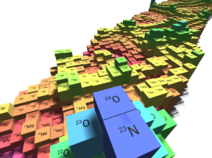
Interactions: Ed Simpson and the 3d nuclide chart
Published in Physics


The 3D Nuclide Chart is a web app put together by Ed Simpson (@SuperSubatomic on Twitter) of the Australian National University. The app lets users plot the nuclear data of their choosing (taken from published data tables), play around with the 3D viewpoint (or work in 2D), set colour schemes and fonts, and then export the visualization as a png file or export the relevant data. The results are rather pretty, and the app is easy to use.
We asked Ed a few questions about the chart.
For our non-nuclear-physicist readers, what does the nuclide chart show?
The nuclide chart is like a nuclear physicists’ periodic table, and is a basic tool of the nuclear science community. Instead of visualising the elements, it plots the properties of nuclides. A nuclide is a specific type of nucleus, defined by its number of protons (Z) and neutrons (N). Plotting nuclides as a function of Z and N gives insights into basic nuclear properties such as radioactive decay and half-lives. It also allows us to spot patterns in nuclear structure, such as the “magic numbers” of protons and neutrons, which greatly add to the stability of nuclides.
Can you let us know a little about the history of nuclide charts?
The earliest nuclide charts date back to the mid 1930s. The evolution of the chart after that is somewhat hidden in the secrecy of the Manhattan Project, where much of the development took place. Declassified Los Alamos reports do tell us, however, that it had reached a recognisably modern form by 1945. The 2D visualisations of the nuclide chart have changed very little since then, though we’ve discovered many more nuclides: from 540 in 1946, to more than 3200 today!
What made you decide to make a new visualization tool for the nuclide chart?

Nuclear physicists often use nuclide charts in publications, talks and outreach materials. The existing online tools were more focused on data than visualisation, and I developed the 3D Nuclide Chart with the primary aim of producing high quality images for reuse elsewhere. The chart has fine-grained control over the appearance – everything from the colour palette to fonts can be changed. Being 3D, it’s perfect for use in outreach and teaching, and being online, all that’s required is a recent web browser.
What are your plans for future developments of the visualization?
The main thing I’d like to add is loading of data from users (e.g., a set of calculations of nuclear masses). Plotting data as a function of time would also be really cool for visualising the abundances of nuclides during astrophysical events like the r-process, which is responsible for creating half the heavy elements we see around us today. I’m always open to suggestions, and many of the developments have come following feedback from users.


Please sign in or register for FREE
If you are a registered user on Research Communities by Springer Nature, please sign in