The isotherms race: upslope in elevation and poleward in latitude
Published in Ecology & Evolution

Before presenting BioShifts and its companion research paper freshly published in Nature Ecology & Evolution, let’s take a minute to clarify what I mean by “the isotherms race”. I assume most of you know what is an isotherm, but it does not hurt to refresh our minds about the meaning and history of this word from Ancient Greek – ἴσος – the same – θέρμη – heat. The father of temperature mapping, who is none other than Alexander von Humboldt (1769-1859), was the first to introduce this concept to describe the invisible line that connects points on a map which receive an equal quantity of heat. It is because of his work and research on the geographical distribution of plants that Alexander von Humboldt had this great idea to draw curves of equal mean annual temperature over the globe. Although it sounds obvious to us right now, it was Alexander von Humboldt’s intuition that the geographical distribution of temperatures on the planet is deeply connected with the geographical distribution of life on Earth. In 1817 in Paris, Alexander von Humboldt published the first isotherm map, sowing the seed of current climate mapping and species distribution modelling.
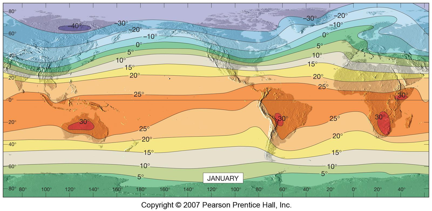
Ok, now why the race? As temperature rises globally, the limit of sea ice and glaciers is retreating poleward and upward. If you are not yet convinced about that, well, have a look at the stunning and mind-boggling movie Chasing Ice. You haven't watch that movie yet? Then, you have to watch it. I highly recommend this movie. James Balog did a wonderful job to document what is happening on the ice fields at high latitudes and high altitudes. Underlying this visible consequence of global warming is the invisible shift of isotherms in a more or less spatially-structured manner: mostly poleward along the latitudinal gradient and upslope along elevational gradients. Although not as direct as the effect of rising temperatures on melting ice, the consequences of rising temperatures are already visible on species range dynamics with a staggering number of studies reporting climate-induced species range shifts. But, many questions remain unanswered. Does the velocity of species range shifts matches the velocity of isotherm shifts? Are marine organisms better than their terrestrial counterparts at tracking isotherm shifts? Do human activities interfere with the velocity of isotherm shifts?
To answer those questions, data on both the velocity of isotherm shifts and the velocity of species range shifts are needed. Although mapping the velocity of isotherm shifts is now facilitated by the access to high-resolution temperature time-series available from several data portals for both terrestrial and marine systems, understanding the velocity of species range shifts across both realms requires to synthetize and harmonize past research over several decades. Now, I guess you understand what I am getting at: the birth of BioShifts.
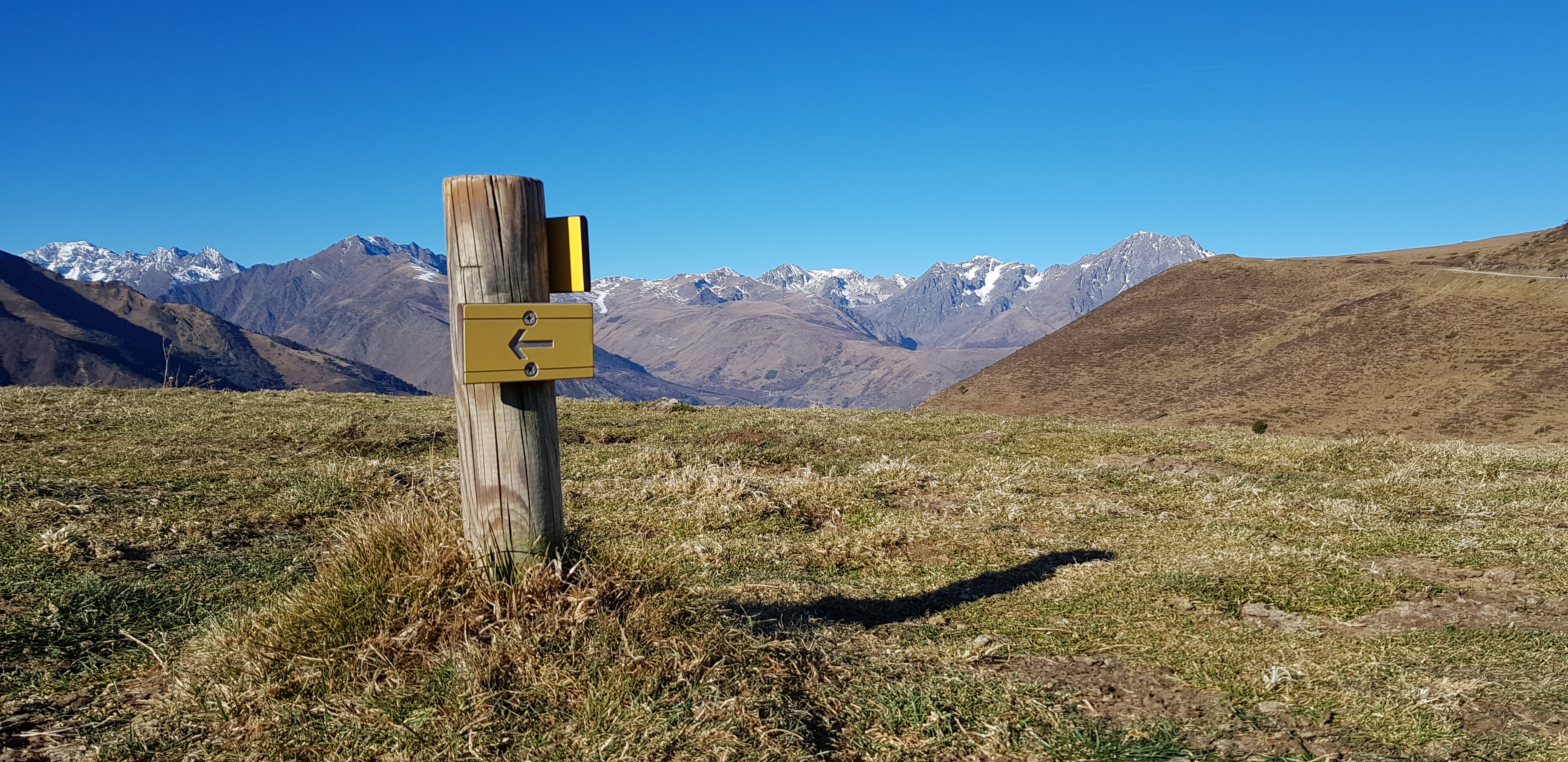
It all started in 2014, after I read a great paper in Nature Communications on species traits and phylogenetic conservatism of climate-induced range shifts in stream fishes from Lise Comte, Jérôme Murienne and Gaël Grenouillet. It was also right at that time that a review paper I wrote together with Jens-Christian Svenning on climate-related range shifts was accepted in Ecography. By a happy coincidence, Lise did read our paper and wrote to me. We naturally made the connection and thought that it would be so great to combine this initial attempt to review the scientific literature on species range shifts across both marine and terrestrial realms with the approach that Lise and her colleagues (Jérôme and Gaël) used to investigate phylogenetic signals in the velocity of species range shifts. Well, it turns out that the current paper which I am telling you the backstory is about “the isotherms race” and not about “phylogenetic signals”, so how the hell did we get there! You will understand that later in this post. Anyway, that was the initial plan. So, we exchanged emails with Lise and a few months later I was visiting Lise, Gaël and Jérôme in Toulouse. Once I arrived at EDB lab to discuss the idea, we all got really excited about it. At the end of the day, we were already sketching the basic skeleton of BioShifts and feeding it with data. Then, back to my office and my daily routine in Amiens, at EDYSAN, time was flying by and the four of us were working in parallel to feed the embryo of BioShifts with more and more data. In the meantime, our group was growing as well and new forces joined the team: Romain Bertrand, Luana Bourgeaud and Tarek Hattab.
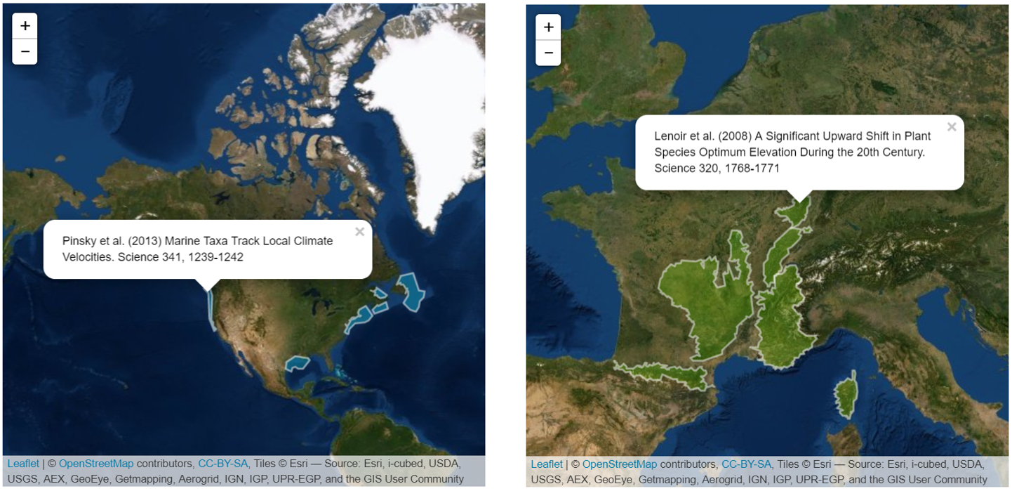
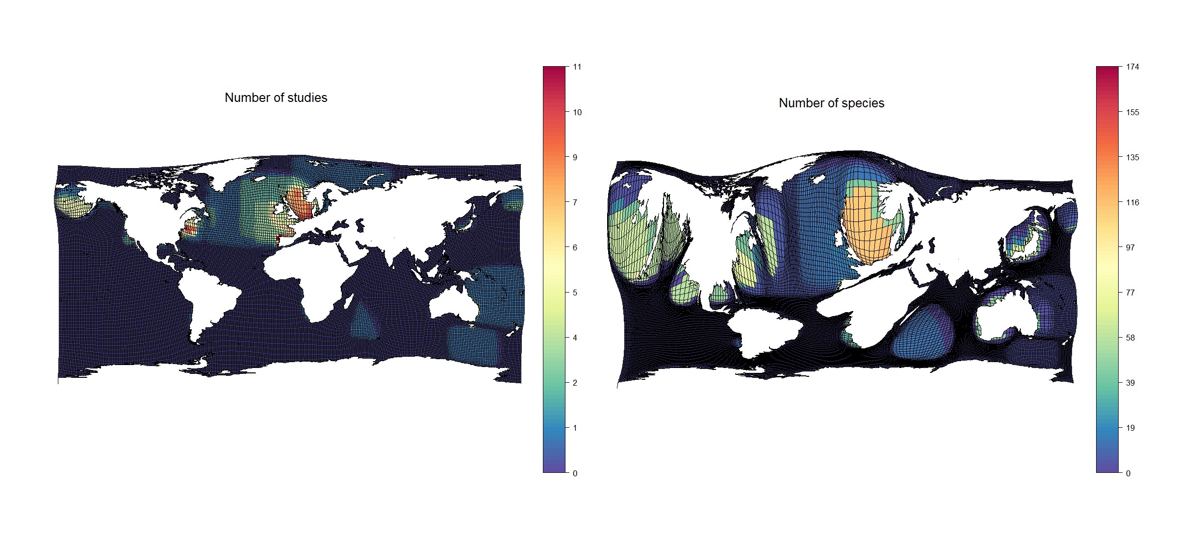
As we were extracting and compiling data on species range shifts, we also painstakingly digitized the study area of each scientific reference (see two exemples in the figure above) that met our criteria for inclusion in BioShifts. This time-consuming task was important and somehow necessary to spatialize the information. You will be happy to know that all the shapefiles that we digitized for BioShifts are freely available for download, together with the data on species range shifts and the R-scripts we wrote and used to analyse the data. To illustrate the spatial distribution of the data stored in BioShifts, please see below for several cartograms that Tarek generated regularly throughout the project duration. Some people don't like it and call it cryptograms (not cryptogams), at least one of our referees did. Yet, I must admit that I am a big fan of this data visualisation tool. Although a matter of taste, I hope to convert some of you here. So, in the figure below are some examples of cartograms for terrestrial systems based on the data included in BioShifts as of July 2017, so a lighter version of BioShifts. The idea behind cartograms is to distort, sometimes excessively, the geometry and shape of maps, either shapefiles or raster files, according to a variable, like sample size. Anyway, all global maps are somehow distorted because no projection system is able to accurately reproduce the true shapes and areas of our continents. So, let's put the distortion factor to good use, right? In the examples below, the distortion is such that the more information in a grid cell the bigger the grid cell. This allows to highlight regions for which we have a lot of data on species range shifts while the curled up regions highlight a clear lack of data. As you can see for terrestrial systems, there is a clear bias with much more data from countries known to have long-term monitoring programs, such as the United Kingdom. We can also see the birdwatchers from Finland very clearly. Yes, Finland is a hotspot for studies on birds.
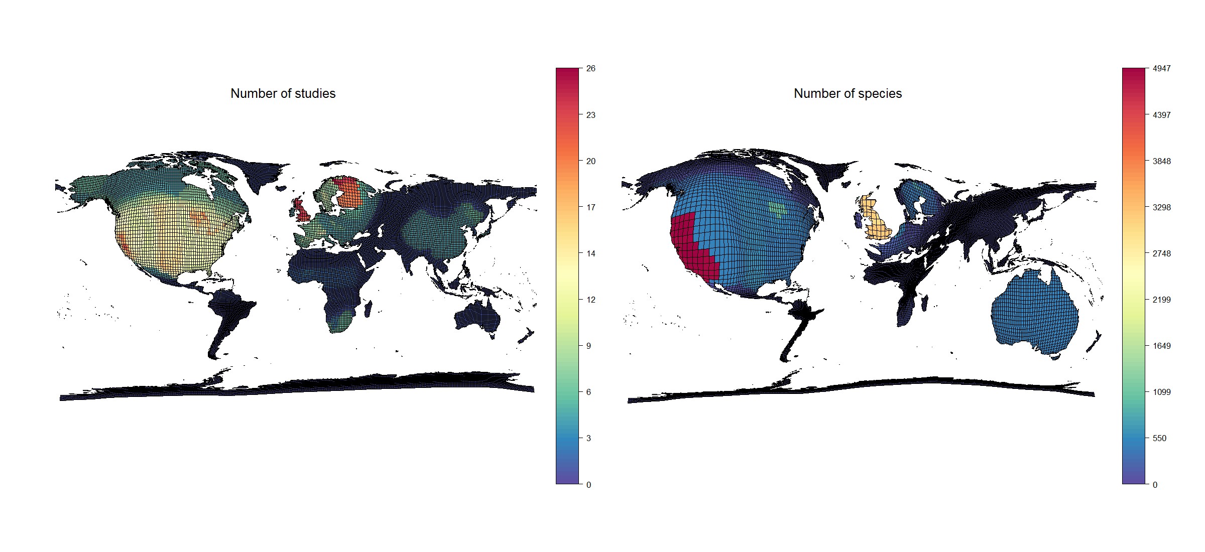
Across the marine realm, the distortions also show a huge bias towards more data in the Northern Hemisphere and especially from the North Sea. Hence, cartograms are a very useful tool to highlight geographical biases in the data. Yet, we have to keep in mind that here we only reviewed scientific literature published in English language and thus potentially missed all the grey literature published in other languages. Hence local and traditional knowledge on species range shifts is missing from those maps and thus from BioShifts. We sincerely apologize for not filling this critical gap here. There is definitely room for improvement here and we call for more interdisciplinary research, maybe involving collaborative projects with linguists and ethnologists, to incorporate local and traditional knowledge in such databases and maps.
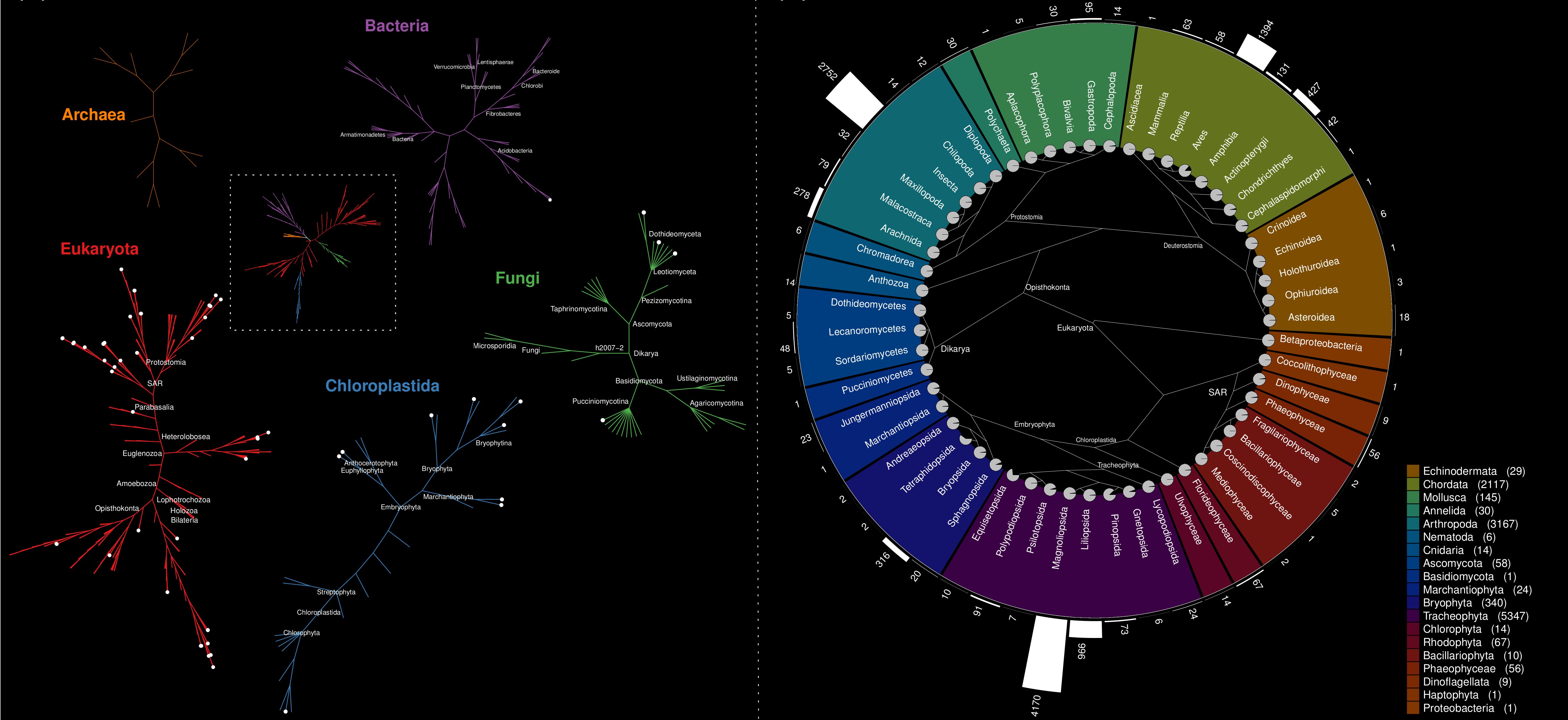
Not only the geographical biases are evident in BioShifts but the taxonomic biases are also very much pronounced. Below is a visualisation also made by Tarek and which depicts pretty well the taxonomic coverage of BioShifts as of September 2018, so not exactly the current version of BioShifts but quite close to it. It speaks for itself, some taxonomic groups are overrepresented (birds, fishes, flowering plants) while others are simply underrepresented (bacteria, nematodes, fungi, algae).
While sailing the seas of data mining on board of BioShifts, we had highs and lows. More data were clearly needed on the phylogeny of the different taxonomic groups covered by BioShifts before we could even search for phylogenetic signals in the velocity of species range shifts. So, we started to initiate “side projects” besides this main objective on which we are still working on at the moment. Yes, that’s right! I am telling you the backstory of a side project here.
In fall 2018, the seven of us were working really hard on a draft and in December 2018 we submitted our very first draft to a journal. Whether this is a fun fact or not, the main message of that very first draft was totally different: terrestrial and marine species were shifting faster at the trailing edge than at the leading edge! We were quite convinced that we found an important finding here. When the paper went back from review, one of the three referees was very sceptical about our main finding and asked us to double check our analyses. Guess what? The referee was right. We double-checked all our R-scripts and codes and found an error with a multiplying factor of “2” hanging in one of our model formulas, where it should not have been. After correcting this mistake, the pattern was gone and species were shifting just as fast at the trailing and leading edge. Yes, this "tiny" multiplying factor was responsible for the pattern we thought we found. Crazy, no? The reason why I am telling you this "fun fact" is to keep in mind how valuable the whole review process is.
In addition, one referee suggested us to investigate how much variation in our data on species range shifts was explained by the velocity of isotherm shifts, while another referee recommended us to take into account the impact of human pressures on the environment when analysing the velocity of species range shifts. Here we are, back to “the isotherms race”! Hence, following advices from all referees, we completely revised our manuscript, taking a totally different angle and focusing on the coupling between the velocity of species range shifts and the velocity of isotherm shifts. Maybe one of you, reading those lines, is one of the referees who evaluated our work. If so, thanks again for all your constructive comments which helped us a lot to improve the quality of our work. After some hard work, we finally submitted our new story elsewhere and long story short, involving other great referees who provided additional insightful comments, in early March 2020, our paper was finally accepted in Nature Ecology & Evolution.
So what did we find that is so exiting? For those of you who are still reading me (congratulations to the bravest), we found that marine species are outpacing terrestrial species in the race against global warming and are even closely tracking it in some regions. More important, we found that the unbridled race against global warming is modulated by human pressures on the environment (fishing, aquaculture, agriculture, silviculture, urban planning) speeding up or slowing down the movement of species in their pursuit of more favourable climatic conditions. For instance, faster climate velocities combined with higher human pressures in the oceans increase the velocity of marine species range shifts such that marine species may closely track isotherm shifts in latitude.
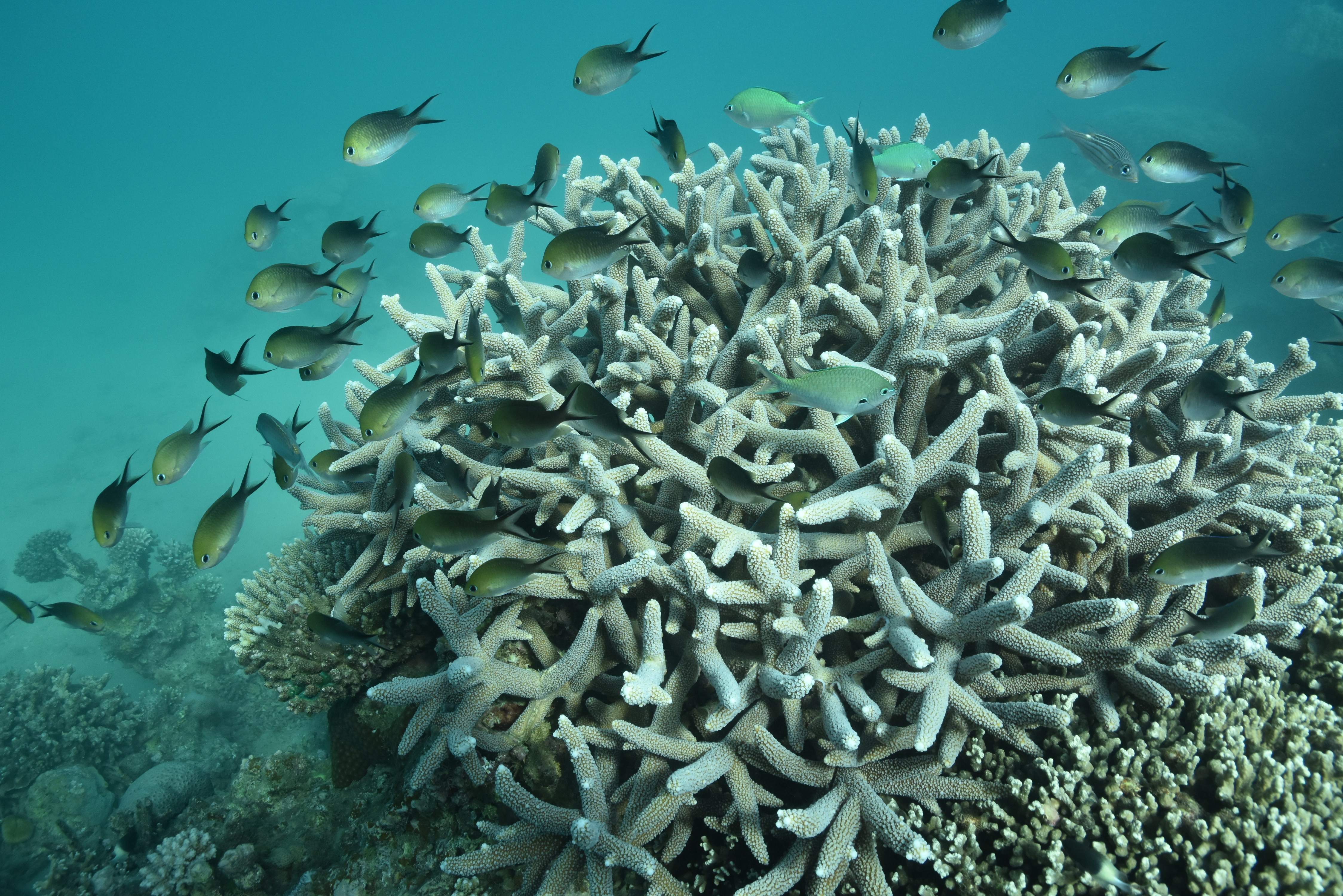
In addition to this synergistic effect between the velocity of isotherm shifts and human pressures in the oceans, we also found another synergistic effect between the velocity of isotherm shifts and sea surface temperatures during the baseline survey, such that marine species are better at tracking isotherm shifts in initially warm than in initially cold waters. This finding is actually very consistent with another recent finding from Laura Antão and her colleagues who found that biodiversity responses to climate change are conditional on the baseline climate, such that in initially warmer locations richness increase is more pronounced.

By contrasts, habitat fragmentation due to human pressures on land seems to decrease the velocity of terrestrial species range shifts along the latitudinal gradient, especially so when the velocity of isotherm shifts is high. Along elevational gradients, human pressures on land had no effect on the velocity of range shifts. However, we found a more pronounced effect of the velocity of isotherm shifts for ectotherms than for the other life forms (endotherms, phanerogams, cryptogams). For instance, amphibians are shifting upslope faster than the other taxonomic groups, especially so in the Southern Hemisphere.
One important take-home message is that species range shifts recorded in BioShifts cover only 0.6% of the total described biodiversity on Earth (n = 2,094,892 taxa). Hence, we need to remain humble about our findings. Like many other quantitative reviews before us, our review of species' responses to climate change is not truly global. More data are clearly needed, especially in the tropics, to improve our understanding of species redistribution under anthropogenic climate change and its consequences on ecosystem functioning and human health.
Follow the Topic
-
Nature Ecology & Evolution
This journal is interested in the full spectrum of ecological and evolutionary biology, encompassing approaches at the molecular, organismal, population, community and ecosystem levels, as well as relevant parts of the social sciences.
Related Collections
With Collections, you can get published faster and increase your visibility.
Biodiversity and ecosystem functioning of global peatlands
Publishing Model: Hybrid
Deadline: Jul 27, 2026
Understanding species redistributions under global climate change
Publishing Model: Hybrid
Deadline: Jun 30, 2026




Please sign in or register for FREE
If you are a registered user on Research Communities by Springer Nature, please sign in