Our popular “Points of View” column returns this month after a brief hiatus. Here is a bit of history of the column and an introduction to its new author.
On this day four years ago Sean O’Donoghue contacted Nature Methods about a workshop he was organizing on visualizing biological data. This culminated in a Nature Methods Supplement on Visualizing Biological Data published one year later that coincided with the first VizBi meeting in Heidelberg, Germany.
During this meeting Bang Wong and I hatched the idea of a Nature Methods column that would provide practical advice on the visual presentation of data for researchers. Later that year our August issue featured Bang’s very first Points of View column, “Color coding“. What followed was a labor of love by both Bang and I, with plenty of stress over deadlines, that extended over two years.
The column seemed to fill a need in the community and generated considerable positive feedback, including from authors and reviewers who would sometimes refer to advice from Bang’s columns. At the end of 2012 Bang took a needed break and the column went on hiatus. But in the meantime I had again met someone at a meeting in Germany who was passionately interested in the visual display of data.
The Points of View column returns in our March issue authored by Martin Krzywinski (staff scientist, creator of the visualization software Circos, and former fashion photographer).
I decided we couldn’t let someone with Martin’s varied experiences debut as the new Points of View columnist without learning a bit more about him so I asked our Technology Editor, Vivien Marx, to see what she could dig up.

Martin Krzywinski
Current mode: Makes cancer research and genome analysis visual.
Introduction to genomics: Built computing infrastructure at Genome Sciences Center
Past activities (incomplete): fashion photography, computer security, particle physics.
Published information graphics (incomplete): Book covers, American Scientist, EMBO Journal, PNAS, The New York Times, Wired, Conde Nast Portfolio.

Alex the rat
Q: You photographed Alex (2000-2002) and helped her become the poster rat for genome sequencing. For example, she was Genome Research’s rat cover-girl. She frequently rode on your shoulder and seems like a groovy friend.
M.K.: Don’t be fooled by Alex’s visual presentation. She bit me countless times. But what do you expect from a rat? Maybe it is I that never learned.
Q: In addition to photo-shoots with Alex, you have had human fashion models in front of your lens. Fashion is pretty. Why should science be pretty?
M.K.: Fashion is pretty, but shallow. Science is deep (and wide) and when pretty, it satisfies both parts of the brain. How do I want to feel when I do or read about science? Complete. For me, the only way this can happen is if I’m visually and cognitively enchanted.
That’s a personal response. The more traditional one would be to say that pretty, here, should be a clear aesthetic that presents information plainly, openly and without adornment, which is rarely done well. We stand to lose a lot when visual communication in science is garbled – our own understanding of it suffers. And when I have to digest a paper in a short period of time, and the figures don’t actually help, I’m faced with a dense wall of text.
Finally, you can only imagine the disappointment of the graduate student who arrives at the lab to find it, and the information contained therein, in a state of visual distress – very much *unlike* presented in the movies. I’m not saying that all labs should look like we’re in Hollywood … but, actually, why not try for that? Or at least a part of it.
Scientists have a fear of visual style, that it might be a surrogate for content. The trick is to have both.
I love irony as a reversal of expectations. I feel that science should follow a related principle – augmentation of expectations. Instead of nonplusing us, it should plus: stimulate more, suggest more, enchant more, inspire more.
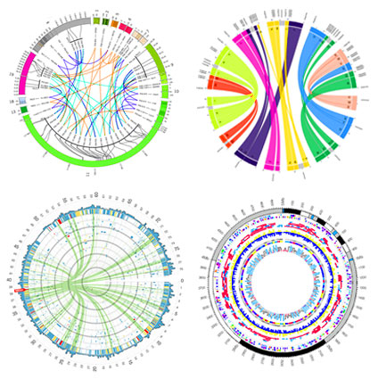
Example Circos plots
Q: As you worked with genome data, you developed the visualization tool Circos. What sparked your interest in creating it?
M.K.: It was created out of necessity. We had all these bacterial artificial chromosome (BAC) clones that appeared to be composed of distant regions of the genome and wanted to see a pattern in these fusions. Putting it around a circle felt like a natural thing to do.
Q: Another project of yours has been about visualizing networks, taking the math of nodes and edges to a new visual place to create hive plots. How did that idea come to be?
M.K.: The hive plot idea came to me from this paper, specifically Figure 1.
The figure makes the same mistake as the linear chromosome layouts that compare rearrangements. Lines cross axes in a jumble and it’s impossible to get a feeling for their density at source/destination. I thought it would be helpful to arrange the three axes in the paper radially (the circular thing has already been done…). It worked and revealed information that was hidden in the original layout.
I also feel deep distrust, bordering on fear, of figures of network layout. Should we take seriously a visualization that’s called a hairball?
Q: Can you share a few biographical milestones, gratifying or memorable events?
M.K.: Two gratifying milestones for me, as someone working on visualization of information, was when I was approached by Wired to depict information from the TV show Lost. If Circos managed to penetrate that deeply into popular culture, something about it worked. http://www.wired.com/magazine/2010/04/ff_lost/5/
I was recently asked to speak at the first Bloomberg Design Conference, which was another very gratifying experience. Both design and science are a process, with different outcomes (which are frequently updated as new knowledge or styles emerge).
In both fields, the process is one of choice (what do I do, what do I not do, what is important, what is not?) and for a designer to say that science, as a process, is irrelevant is as silly as for the scientist to argue that design is irrelevant.
To find things out, to communicate clearly, we have to choose. Often, against our own intuition and incomplete understanding, which can lead us astray. Scientists craft their words carefully in publications. I think we’re finally realizing – as a community – that we must do the same with our figures and visuals.
Q: On your web site you have a collection of spam poetry, for example: ‘this today passed late.’ That is deep, how can spam poetry be so deep?
M.K. Thanks for taking time to read the ee spammings. I hope you enjoyed some of them. Spam poetry can be deep because I’ve taken the time to remove all the cruft that was filling in the deep cracks. Those cracks are there, at all times (“There’s a crack in everything. That’s how the light gets in.” -Leonard Cohen), and to see them we sometimes need to take away rather than add.
The spammings do two things that matter to me: reverse expectations of what spam is good for (irony) and poke fun at poetry (satire). I’m under no illusion that all the spammings are golden, but at least a few are gilded.
Q: It appears you have a weakness for espresso, do you have a favorite time of day for that past-time?
MK: For espresso, 3pm is the best time. Sartre said “Three o’clock is always too late or too early for anything you want to do.” and I agree, so I fill that time with an espresso intermission which is both a rest from things done and preparation for things to yet do.
Update: Read Martin’s first Points of View column, “Axes, ticks and grids“.


Please sign in or register for FREE
If you are a registered user on Research Communities by Springer Nature, please sign in