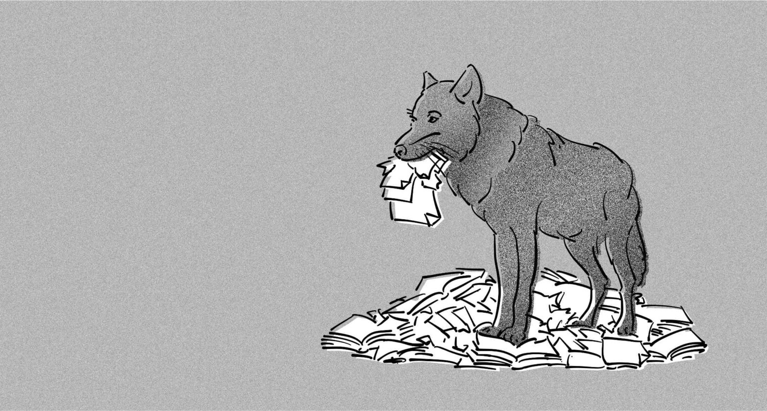
The graphic design of predatory papers
Published in Healthcare & Nursing, Astronomy, and Social Sciences
The ultimate medium of scientific communication is a paper in a refereed journal. (Saffran, 1987)
Most researchers are evaluated primarily on their scholarly output, which is often measured by the number of publications they produce. Anyone even marginally engaged in academia is familiar with the challenge: conducting sound research, preparing a manuscript, navigating the submission process, undergoing peer review, and revising a paper are all demanding tasks that consume considerable time and effort. Time, however, is a resource that some scholars either do not have, or are unwilling – or unable – to invest.
A wide range of dubious business models exploit this structural problem. Thousands of self-proclaimed ‘academic journals’ have emerged that apply only minimal – or entirely absent –quality assurance procedures, provided that authors are willing to pay. In practice, the publishers of such outlets exploit the need (and often the ignorance or unawareness) of researchers by offering guaranteed publication regardless of quality. At the same time, these journals claim on their websites that submitted manuscripts are subject to peer review. Within academic discourse, this practice is referred to as predatory publishing.
The strange design of predatory publishing
For our research we examined a large number of predatory journals. One striking observation was that their published articles looked ‘off’ even at first glance. With experience in academia, one develops an intuitive sense that something about these documents is not quite right.
The ‘Uncanny Valley’
The underlying reason for this phenomenon is straightforward: predatory publishers are primarily motivated by financial gain. Consequently, they show little interest in branding, design, or even minimal standards of aesthetics and layout. On the contrary, investing in professional design incurs costs. Nevertheless, the publications must at least superficially resemble those issued by reputable publishers. The result is that most papers look as though they were hastily assembled with standard office software. While more design effort is evident than in a plain Word or LibreOffice template, the outcome still lacks the refinement of professional typesetting.
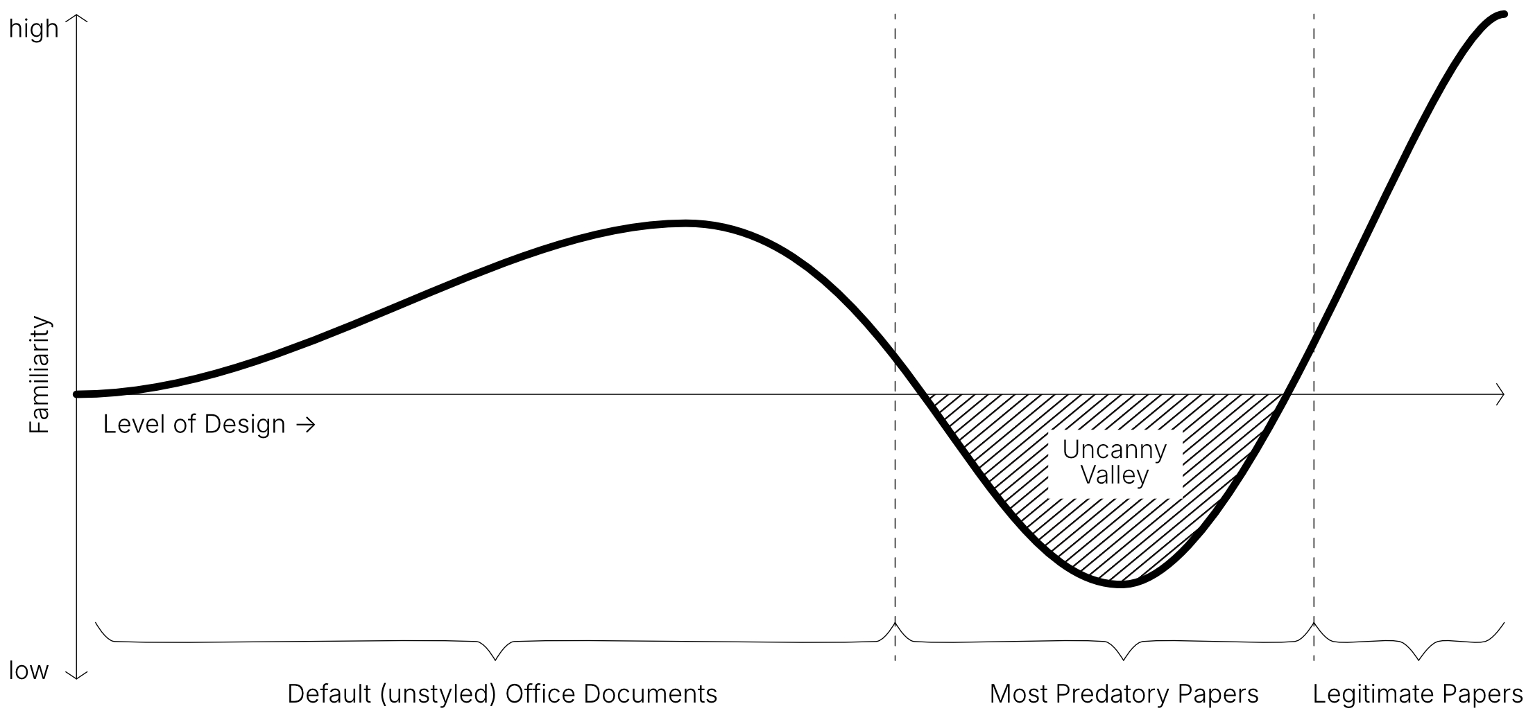
This situation recalls the concept of the Uncanny Valley in computer graphics, which suggests that the more closely a (3D) model approximates a human, the more unsettling it becomes – until it eventually becomes indistinguishable from a real human being, at which point the sense of uncanniness disappears. Predatory papers occupy a similar space: they feature ‘more design’ than rudimentary office documents, yet appear less polished than articles produced by established publishers, and therefore may appear ‘uncanny’.
Selected Findings from the Study
In our research, we compared 443 legitimate (i.e., reputable) with 555 potentially predatory publications. Several key patterns emerged:
-
On average, articles from predatory journals are significantly shorter than those from reputable outlets, both in character count and in page length.
-
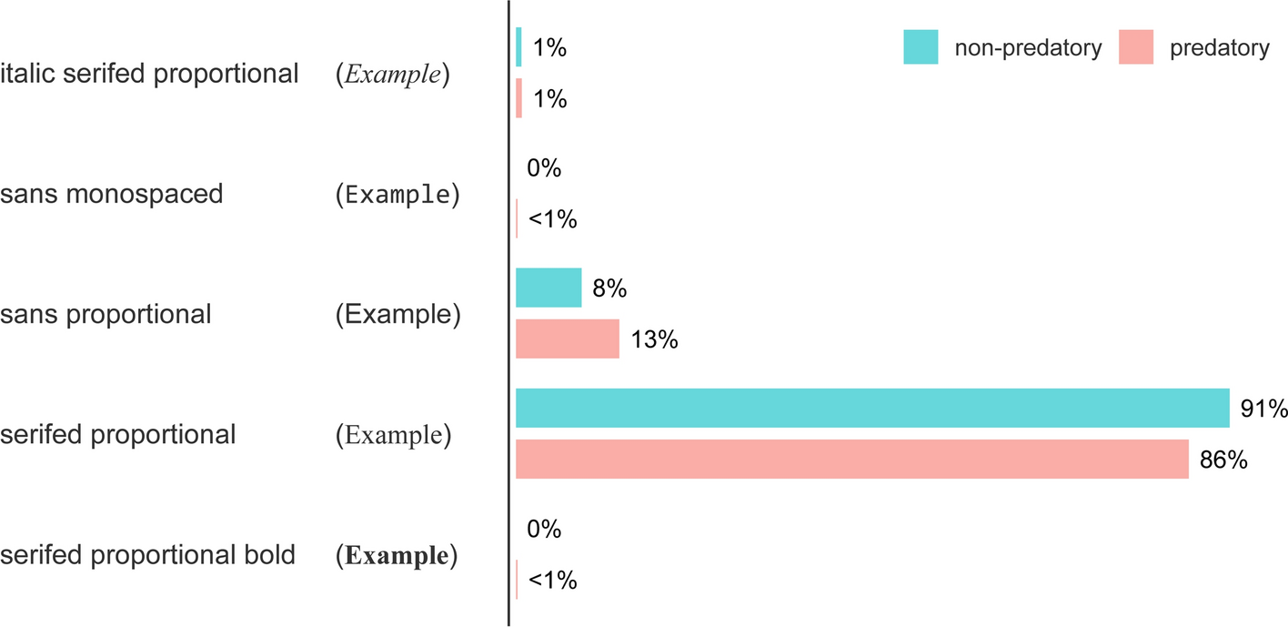
Established journals employ greater typographic variation (e.g., italics, boldface) and a wider range of font sizes.
-
Standard fonts such as Arial, Times New Roman, Calibri, or Cambria are used far less frequently in reputable journals.
-
PDF metadata show that predatory journals rely much more heavily on standard office software to generate their documents.
-
Predatory journals include significantly fewer figures and graphics than legitimate publications.
-
Title pages of reputable journals are comparatively uniform, while those of predatory journals display greater inconsistency.
Predatory Mimicry
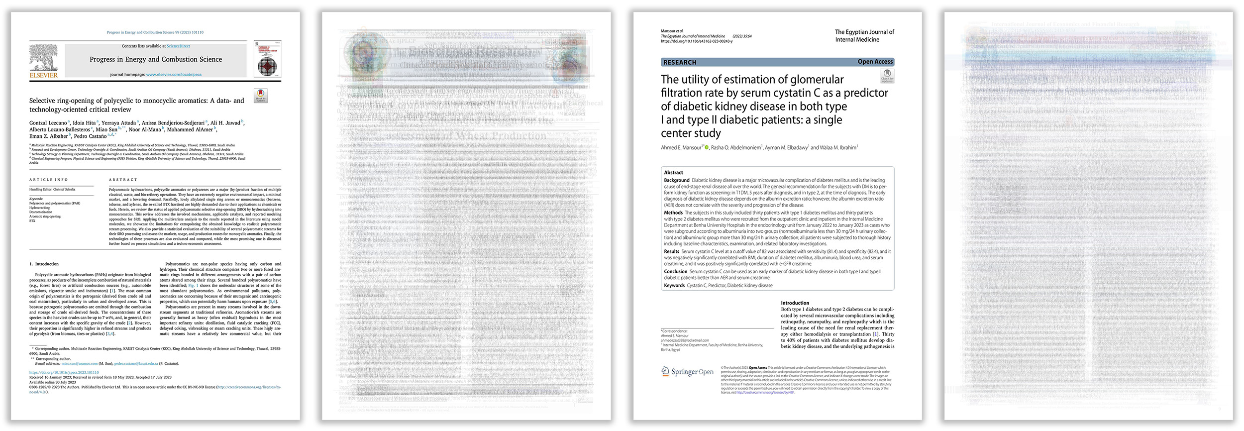
During the study, we also observed that some predatory journals attempt to imitate the design of established publishers. In particular, layouts resembling those of Elsevier and Springer Open appeared frequently. This further illustrates the Uncanny Valley effect: while the imitation may seem plausible at first glance, experienced researchers can quickly detect its inadequacy – often due to the lack of professional tools and production standards available to predatory publishers.
Conclusion
Predatory publishing continues to pose a significant challenge for scholarly communication. Although the findings of our study should not be regarded as a definitive basis for decision-making, we hope they will contribute to raising awareness of this problematic practice. Such awareness is crucial to prevent (early-career) researchers from being exploited by predatory outlets.
Andreas Sieß, PhD, conducts research on science communication in the social sciences and humanities at Bonn-Rhein-Sieg University of Applied Sciences as part of the Rhine-Ruhr-Center for Science Communication Research, funded by the Volkswagen Foundation. In addition, he works on questions of spatial and design aesthetics in urban contexts and is active as a freelance media artist, with exhibits shown, among others, at the Venice Architecture Biennale and at the Center for Art and Media Karlsruhe.
Follow the Topic
-
Scientometrics
This is an international, peer-reviewed, monthly journal that publishes original research on all quantitative aspects of the production, communication, and use of scientific and technological information.

Related Collections
With Collections, you can get published faster and increase your visibility.
Bibliometric Measures of Epistemic Change
Bibliometrics has a long-standing interest in tracing epistemic change. The question of how epistemic change is reflected in publications is implicit to evaluative bibliometrics because the quality of a paper is measured through its impact, which can be understood as the extent to which a paper changes later research. Beyond this idea underlying bibliometric assessments, the question of how to identify and trace emerging fields or emerging technologies has attracted considerable attention (Small et al. 2014, Rotolo et al. 2015), and the dynamics of topics has been traced with bibliometric methods (McCain 2010, Leydesdorff and Rafols 2011). These approaches either identify emerging topics and technologies by searching for rapidly growing clusters of publication or trace changes that are known to exist and trace them using citation patterns, keywords or combinations thereof. The current interest in the identification of exceptional (e.g., so-called novel or disruptive) papers reflects a similar interest in epistemic change (Evans 2010, Azoulay et al. 2011, Klavans et al. 2014, Wang et al. 2017, Shibayama and Wang 2020, Park et al. 2023).
The application of bibliometric methods for tracing epistemic change also appears to be hindered by constraints that are not necessary but appear to be somewhat self-inflicted in that they are due to methodological traditions that are taken for granted in bibliometrics. These ‘soft’ limitations of bibliometric indicators are exemplified by the recent deluge of new indicators which purportedly describe epistemic change. Indicators like Innovativeness, Novelty, Originality or Disruptiveness describe single papers and attempt to codify the epistemic change they bring about (e.g. Ayoubi et al. 2021, Park et al. 2023). This design is based on three implicit assumptions. First, the construction of indicators of epistemic change from metadata of individual papers implies the assumption that the epistemic change is an event rather than a process. Only an epistemic event could be described by a single paper, while describing an epistemic process requires the consideration of a set of papers which report research processes building on each other. Second, the construction of these indicators also assumes that the event that is measured by the indicator is fully reported in exactly one paper. Each indicator only processes metadata of one single paper. Third, indicators sacrifice specificity for comparability. As a consequence, they attempt to describe “how much” epistemic change is represented by the paper while being unable to report the kind of change that has occurred.
These three limitations, which appear to be the results of choices made by indicator designers rather than ‘hardwired’ limitations of bibliometrics, come on top of the only truly hardwired limitation, namely the dependence of bibliometrics on the signal about a publication’s content that is contained by the publication’s metadata. This limitation raises a fundamental question about the validity of bibliometric measures of epistemic change. Since we don’t know how the content of a paper is reflected in the bibliometric metadata, we cannot assess the content or strength of the signal metadata contain and thus cannot know if the signal is validly codified by an indicator.
The special collection presents papers that were developed in a series of workshops which addressed these four challenges. It includes the following topics:
Conceptualisation and operationalisation: How can epistemic change be conceptualised in a way that supports the operationalisation of concepts for the bibliometric tracing of epistemic change?
Ground truths: How can ground truths be constructed for the development and tests of bibliometric methods for tracing epistemic change?
Metadata: Which information about epistemic change is included in bibliographic metadata and can thus be exploited by bibliometric methods?
Validation: How do established bibliometric indicators fare when trying to recover the ground truths?
Artificial intelligence: How can epistemic change identified in publications with the application of LLMs to full texts of publications?
References
Ayoubi, C., M. Pezzoni and F. Visentin (2021). "Does It Pay to Do Novel Science? The Selectivity Patterns in Science Funding." Science and Public Policy 48(5): 635-648.
Azoulay, P., J. S. Graff Zivin and G. Manso (2011). "Incentives and creativity: evidence from the academic life sciences." The RAND Journal of Economics 42(3): 527-554.
Evans, J. A. (2010). "Industry Induces Academic Science to Know Less about More." American Journal of Sociology 116(2): 389-452.
Klavans, R., K. Boyack, H. Small, A. A. Sorensen and J. P. A. Ioannidis (2014). Indicators of Innovative Research. Context counts: proceedings of the STI 2014. E. Noyons. Leiden, Universiteit Leiden: 314-320.
Leydesdorff, L. and I. Rafols (2011). "Local emergence and global diffusion of research technologies: An exploration of patterns of network formation." Journal of the American Society for Information Science and Technology 62(5): 846-860.
McCain, K. W. (2010). "Core journal literatures and persistent research themes in an emerging interdisciplinary field: Exploring the literature of the evolutionary development biology." Journal of Informetrics 4: 157-165.
Park, M., E. Leahey and R. J. Funk (2023). "Papers and patents are becoming less disruptive over time." Nature 613(7942): 138-144.
Rotolo, D., D. Hicks and B. R. Martin (2015). "What is an emerging technology?" Research Policy 44(10): 1827-1843.
Shibayama, S. and J. Wang (2020). "Measuring originality in science." Scientometrics 122(1): 409-427.
Small, H., K. W. Boyack and R. Klavans (2014). "Identifying emerging topics in science and technology." Research Policy 43(8): 1450-1467.
Wang, J., R. Veugelers and P. Stephan (2017). "Bias against novelty in science: A cautionary tale for users of bibliometric indicators." Research Policy 46(8): 1416-1436.
Publishing Model: Hybrid
Deadline: Oct 31, 2026


Please sign in or register for FREE
If you are a registered user on Research Communities by Springer Nature, please sign in